Preview image. Unlock full-res
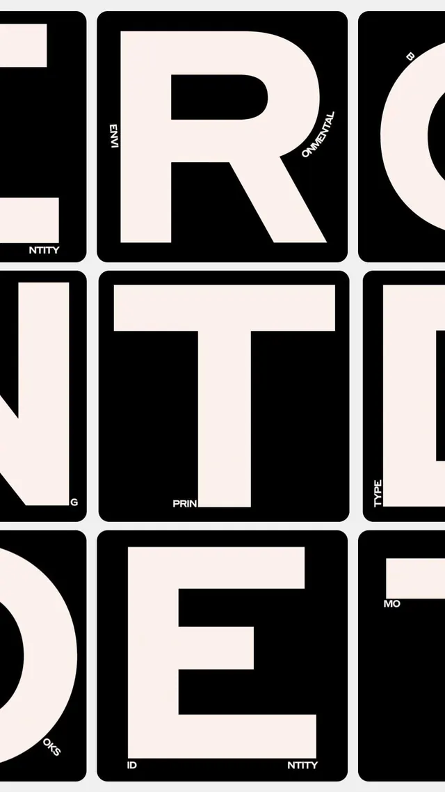
A high-contrast monochrome type specimen showcasing large capital letterforms within an ordered grid of rounded-corner tiles, each marked with labels.
Summary
A modular type specimen system using high-contrast black and off-white tiles with rounded corners, each displaying a capital letterform and paired with small descriptive labels positioned on the edges.
Visual description
Three rows of a 3x3 grid of rounded-corner tiles alternate black and off-white backgrounds. Each tile contains either a single large capital letter or a short word (like "PRINT", "ID", "ENTITY"). Letter tiles display R, E, T in black on light or light on black. Tiles are framed by a thick black border. Small sans-serif labels are inset near tile edges: "EMI", "ORNAMENTAL", "PRINT", "ENTITY", "ID", "IDENTITY", "MOODS", "OKSS". The composition is rigidly geometric and symmetrical, emphasizing the modular grid and spatial relationships between characters.
Key takeaway
The labeling system showing type categories (entity, ornamental, identity, mood, etc.) makes the specimen functional as a brand-identity reference guide, not just a display. The rounded-corner tile format with thick borders creates a contained, systematic feel. The strict monochrome and high-contrast make individual letters read clearly even at large sizes.
Reuse notes
Strong reference for designing a brand's typographic system documentation. Works best when you want to show a font's applications across role categories (display, body, accent) or different languages. The grid layout scales to any number of letters and keeps composition legible at a glance.
More like this




Keep what you find
A free account saves references to boards and can send you a weekly email of picks based on what you save.
To see every result, go Pro.