Preview image. Unlock full-res
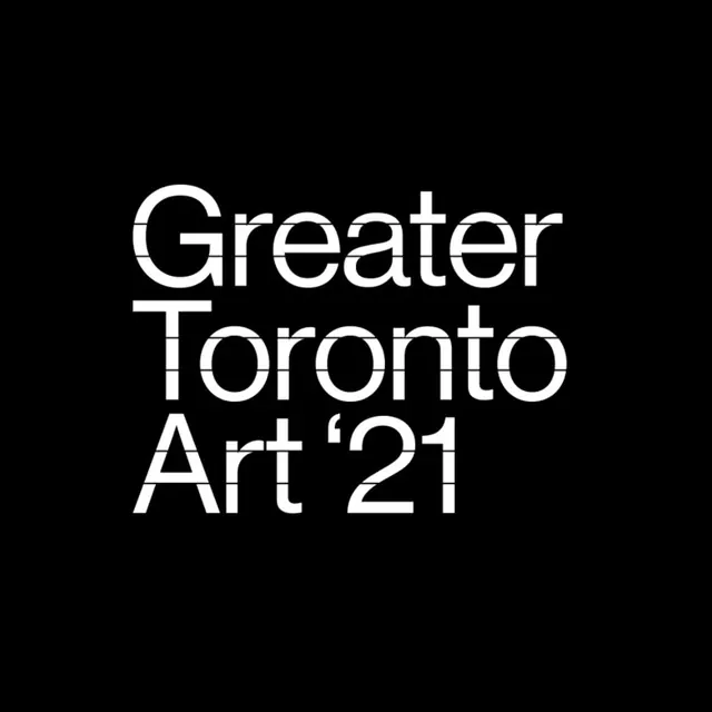
A high-contrast minimalist wordmark stacking 'Greater Toronto Art '21' in a geometric sans-serif across a pure black background.
Summary
Event branding for a 2021 Toronto art initiative using stacked lines of white geometric sans-serif type set in all caps against a black background.
Visual description
The composition centers three lines of uppercase text in a tall, geometric sans-serif: "Greater" (first line), "Toronto" (second), "Art '21" (third). Each line is tightly kerned and sits at equal vertical spacing. The typeface is characteristically modern with uniform stroke weight and minimal ink traps, giving it a crisp, almost stencil-like quality. Pure white on pure black creates maximum contrast and legibility. The type fills roughly the center third of the vertical space, leaving generous black negative space above and below.
Key takeaway
The spare, direct approach: no decorative elements, no color, no secondary marks. The stacked hierarchy is effortless to read at any scale. The thick, geometric typeface conveys authority and cultural credibility simultaneously. Black and white is a default for gallery and museum branding for good reason.
Reuse notes
Ideal template for arts institutions, exhibitions, and cultural events that need instant gravitas. The stacked format adapts well to signage, web headers, and print collateral. The high contrast ensures reproduction quality on any medium. Works equally well in grayscale or inverted (white background, black type).
More like this






Keep what you find
A free account saves references to boards and can send you a weekly email of picks based on what you save.
To see every result, go Pro.