Preview image. Unlock full-res
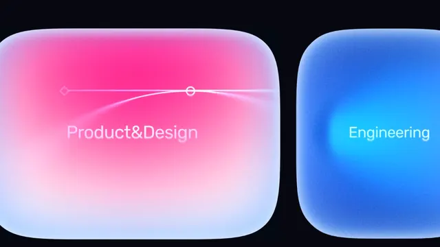
Two rounded-rectangle tiles with opposing color gradients (pink-to-white and blue-to-white) separated by a thin divider, labeled in light sans-serif type.
Summary
Two rounded-rectangle tiles with opposing color gradients (pink-to-white and blue-to-white) separated by a thin divider, labeled in light sans-serif type.
Visual description
A dark navy background holds two adjacent rounded-rectangle cards. The left card transitions from hot pink to pale white via a diagonal gradient; the right card mirrors the gradient in electric blue to white. Both tiles feature soft inner glows centered near their bottom-right quadrants, enhancing the sense of luminosity. White sans-serif labels appear centered in each card: 'Product&Design' (left) and 'Engineering' (right). A thin vertical divider separates them. Rounded corners and high contrast between the gradients and dark surround create a modern, app-like appearance.
Key takeaway
The complementary gradient pair (warm vs. cool) as a visual metaphor for duality. The soft inner glow technique lifts the cards off the background without a shadow. Rounded corners and the thin dividing line create both separation and unity. The label placement (centered, light weight) reads clearly over the gradient without appearing heavy.
Reuse notes
Ideal for SaaS products with multiple distinct teams, services, or product lines needing clear visual separation. The gradient-heavy approach reads futuristic and premium; works well in dashboards or team-role abstractions. Pair with solid, minimal backgrounds. Ensure sufficient contrast if adapting the gradients or label colors.