Preview image. Unlock full-res
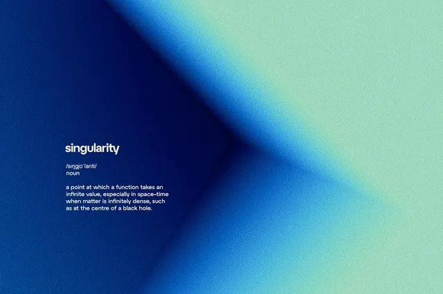
Minimal brand mark featuring 'Singularity' wordmark with definition text over a diagonal gradient sweeping from deep navy to mint green, accompanied by subtle sans-serif descriptors.
Summary
Logo for 'Singularity' displaying the word in white sans-serif over a sweeping diagonal gradient transitioning from deep navy at upper left to soft mint green at lower right, with definition text and etymology below.
Visual description
Diagonal gradient field dominating the composition: deep navy blue (#073A85 or similar) occupies the upper-left third, transitioning through cyan and powder blue mid-field, ending in pale mint green (#9DD7BE or similar) at the lower-right corner. The gradient is smooth and geometric, following a clean 45-degree diagonal. White sans-serif wordmark "singularity" sits centered in white caps, positioned roughly in the upper half. Below the mark, smaller white text reads "/singjo'lariti/" (phonetic pronunciation) and "noun", followed by a multi-line definition in smaller sans-serif: "a point at which a function takes an infinite value, especially in space-time when matter is infinitely dense, such as at the centre of a black hole." All typography is set flush-left within the mark area. No photographic elements, no decorative flourishes; the design priority is the gradient and the geometric simplicity of the composition.
Key takeaway
The use of an analogous color transition (navy into cyan into mint) as the entire visual foundation of the mark, creating depth and movement through color alone. The clever integration of textual definition directly into the visual identity, turning the mark into both logo and teaching device. The geometric diagonal axis as a compositional organizing principle that suggests motion and progress without explicit symbolism.
Reuse notes
Excellent template for tech, science, and education brands that benefit from a concept-driven identity. The gradient naturally reads as sophisticated and forward-thinking; the definition text grounds an abstract wordmark with substance and meaning. The mint-to-navy palette signals both technical rigor and calm (suited to analytics, data, or scientific tools). Works well on dark backgrounds; test carefully on light backgrounds to ensure the white type and lower-contrast gradient end remain legible. The pattern is particularly strong for startups, research institutions, or tools that need to communicate both innovation and trustworthiness.