Preview image. Unlock full-res
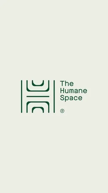
A geometric mark built from two stacked rounded rectangles paired with a clean sans-serif wordmark; dark teal on soft beige grounds an identity system rooted in restraint and form.
Summary
A geometric wordmark built from stacked rounded-corner rectangles paired with a condensed sans-serif name; muted teal strokes on warm beige demonstrate restraint as a design system anchor.
Visual description
A geometric abstraction forms the left side: two rounded rectangular frames nested and stacked in dark teal, leaving white negative space between them. To the right, the wordmark "The Humane Space" sits in a clean, modern sans-serif at cap height, with a small registered trademark symbol below. The entire mark is centered in a warm beige field, creating a high-contrast, calm composition. Thick strokes in the geometric form and even letter spacing throughout signal precision.
Key takeaway
The nesting technique in the geometric form creates visual depth from a single color. The pairing of geometric abstraction with straightforward sans-serif text establishes hierarchy without additional typeface variation. The color restraint—one teal, one background—proves that a single accent color can ground an entire identity.
Reuse notes
Ideal as a foundation for sustainable, healthcare, or tech companies wanting a calm, approachable yet refined aesthetic. The geometric form scales well across sizes (letterhead, favicon, app icon). Works especially well where serenity or trust is a brand attribute. Avoid in contexts requiring high energy or playfulness.
More like this



Keep what you find
A free account saves references to boards and can send you a weekly email of picks based on what you save.
To see every result, go Pro.