Preview image. Unlock full-res
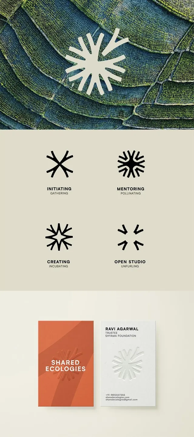
Comprehensive brand identity for a nonprofit featuring a radial starburst icon, four functional variations, and applied collateral (business cards) on a coordinated earthy palette.
Summary
A cohesive nonprofit identity system built around a radial starburst icon, showing four labeled functional variations and applied implementation on branded collateral.
Visual description
The top section displays the primary starburst icon in white overlaid on a textured aerial photograph in deep teals and greens, establishing visual context. Below, a cream-colored section presents four iterations of the starburst icon at consistent scale: Initiating (eight points), Mentoring (more refined, double-ring effect), Creating (irregular radiating lines), and Open Studio (sparse, asymmetric rays). Each variation sits above its label in condensed sans-serif all-caps. The bottom section shows applied collateral: a folded business card on the left in burnt orange with "SHARED ECOLOGIES" in white, paired with a second card in cream showing "RAVI AGARWAL" and contact details, with a small starburst icon anchor. Warm beige and deep green dominate the palette.
Key takeaway
The icon system's flexibility: a single core geometry (radiating lines from center) adapts to four distinct contexts and moods without losing coherence. The starburst is versatile enough to feel organic or geometric depending on how many rays and how sharp the angles are. Pairing the icon with applied collateral demonstrates real-world implementation and builds confidence in the system. The earthy color palette and natural texture photography ground the design in environmental/ecological meaning without being heavy-handed.
Reuse notes
Excellent reference for nonprofit and educational identity work, particularly organizations focused on growth, networks, mentorship, or sustainability. The four-variation approach is replicable for any symbol that can be simplified or elaborated. Test the icon system at small scales (favicon, social avatars) to ensure each variation remains legible. The warm-to-cool color progression reads naturally and pairs well with paper and printed collateral; less ideal for high-saturation digital contexts. The textured photography adds warmth but can be dropped for a minimalist version.
More like this


Keep what you find
A free account saves references to boards and can send you a weekly email of picks based on what you save.
To see every result, go Pro.