Preview image. Unlock full-res
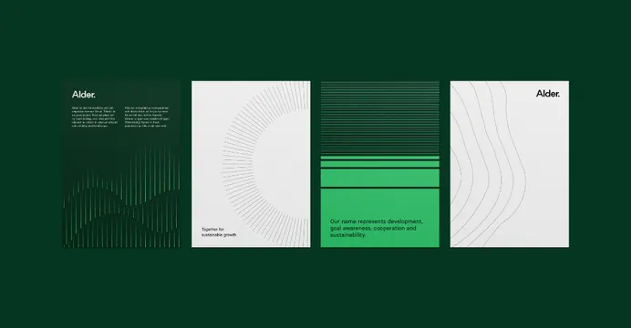
A four-poster brand system for Alder in dark green, mid-green and off-white, where fine concentric and wavy line patterns build a quiet sustainability-led identity.
Summary
A brand identity shown as four portrait posters for Alder, laid out in a row on a dark-green field. Each poster uses a different fine line-pattern (concentric arcs, vertical strands, wavy contour lines) to express one consistent green-and-off-white system.
Visual description
Four equal-width poster panels sit side by side against a deep forest-green background. Panel one is dark green with the Alder wordmark (lowercase, ending in a period dot) top-left over a faint upward line-burst pattern and a short paragraph. Panel two is off-white with a large quarter-circle of thin concentric arcs and the line Together for sustainable growth at the foot. Panel three stacks horizontal green bands, top dark with hairline rules, then a bright mid-green block carrying a positioning statement about name development, goal awareness and sustainability. Panel four is off-white with flowing wavy contour lines and the Alder mark top-right. The palette is restricted to dark green, bright green and pale grey, and every panel is built from one shared thin-line motif.
Key takeaway
Deriving a whole poster series from a single line-drawing motif and just changing its expression (radiating burst, concentric arcs, wavy contours) per panel, so the set reads as one system without repeating a literal logo. The lowercase wordmark with a trailing period as a compact, ownable mark. Limiting to three values keeps the suite calm enough for a sustainability brand.
Reuse notes
A clean template for a sustainability, environmental or B2B brand rollout, a report cover series, or a pitch appendix showing identity range. The line-pattern engine extends easily to social tiles and section dividers. Keep the palette tight; the effect collapses if more than one accent color is added.
More like this






Keep what you find
A free account saves references to boards and can send you a weekly email of picks based on what you save.
To see every result, go Pro.