Preview image. Unlock full-res
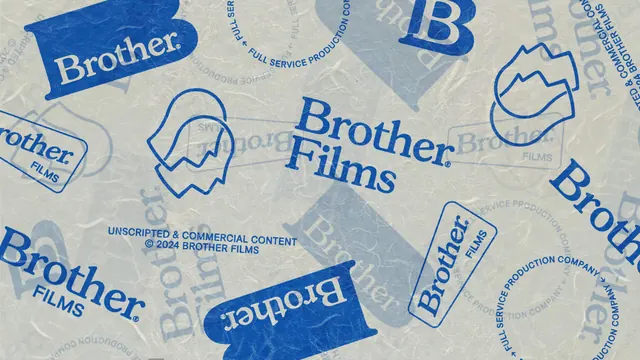
The full mark family scattered and overlapped across textured paper in two blues, showing wordmark, container B, badges, circular lockups and outline icons together.
More like this
See all
Summary
A single frame that lays out the whole asset kit at once, arranging every logo variant across a crumpled paper ground at mixed scales, rotations and opacities.
Visual description
The ground is a pale grey green fibrous paper. Marks in solid cobalt, outline cobalt and a faded ghosted blue sit at different angles and sizes, some running off every edge. Visible variants include the solid container B with Brother reversed out, the two line Brother Films wordmark, a Brother over FILMS lockup, a rounded rectangle outline badge, a rotated pill badge, a circular lockup with FULL SERVICE PRODUCTION COMPANY set around the ring, an outline icon of two overlapping head profiles, and a second outline icon reading as a mountain or peak shape. Centered in the composition a small all caps line reads UNSCRIPTED and COMMERCIAL CONTENT above a dated copyright line. Lighter ghosted copies of the same marks sit behind the solid ones, creating depth without adding a third color.
Key takeaway
Presenting the entire kit as one collage proves the system's range in a single image and doubles as a usable pattern for wraps, endpapers or packaging. Ghosting some copies back to a tint gives layering while the palette stays at two inks.
Reuse notes
Reach for this as a case study slide or a brand guideline opener when you need to show breadth quickly. It only works when the variants genuinely differ in shape; a set of near identical lockups would read as clutter rather than a system.
More like this

Keep what you find
A free account saves references to boards and can send you a weekly email of picks based on what you save.
To see every result, go Pro.