Preview image. Unlock full-res
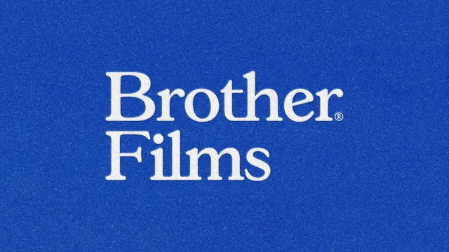
Two line white serif wordmark centered on a grainy cobalt blue field, with a small registered mark tucked at the end of the first line.
More like this
See all


Summary
The primary wordmark presented alone and large: Brother over Films in an off white serif on a saturated cobalt ground, with a heavy film grain across the whole frame.
Visual description
Two words stack on tight leading, left aligned to each other and set slightly left of the frame center. The letterforms are a high contrast transitional serif with bracketed serifs, a rounded lowercase and a noticeably wide r and h. A small circled registered symbol sits on the baseline after Brother rather than after the full name. The type carries a faint soft shadow that reads as a light emboss or a slight print misregister, and uniform speckled grain sits over both the blue field and the letters, so nothing in the frame is perfectly flat.
Key takeaway
Splitting the name across two lines and hanging the trademark off the first word gives the mark an old print catalogue feel while keeping it a single tidy block. The grain is what turns a plain serif on blue into something with a decade attached to it.
Reuse notes
A clean reference for a text only identity that wants warmth without a custom drawing. Pairs with the rest of this project's badge and container variations. The grain needs a matching treatment everywhere else or the mark will look inconsistent next to crisp digital assets.