Preview image. Unlock full-res
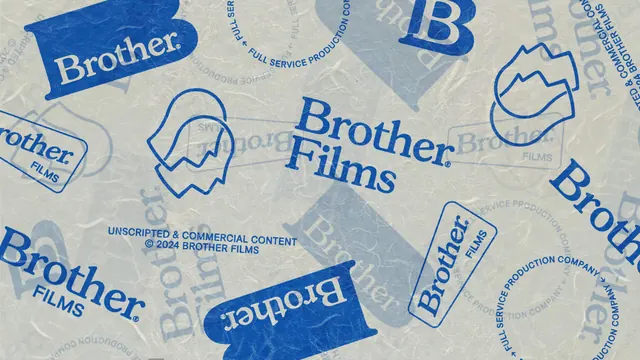
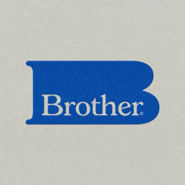
A blue slab shaped B monogram on textured off white paper, with the word Brother reversed out across its lower half.
More like this
See all
Summary
The monogram version of the identity: an oversized, very wide blue B used as a container, with the wordmark sitting inside it rather than beside it.
Visual description
A single solid cobalt shape fills the middle third of a square off white field. The shape reads as a B stretched far past normal proportion, with a short flat stem on the left and two broad rounded bowls that run almost to the right edge of the shape, giving it the look of a flag or a folded ribbon. Across the lower bowl the word Brother is reversed out in the same off white as the background, set in the identity serif with a small registered symbol after the final r. Both the paper ground and the blue fill carry a fine speckled grain, and the shape's edges are slightly soft as if screen printed.
Key takeaway
Setting the word inside the counter of its own initial makes one asset do the job of a monogram and a wordmark at once, so it survives being cropped to a square avatar or a sticker. The extreme width is the whole personality; a normally proportioned B would be forgettable.
Reuse notes
Good reference for a mark that needs to work as an app icon, sticker or stamp while still spelling out the name. Only holds up at sizes where the reversed word stays legible; below that you would need the shape alone or the plain wordmark.