Preview image. Unlock full-res
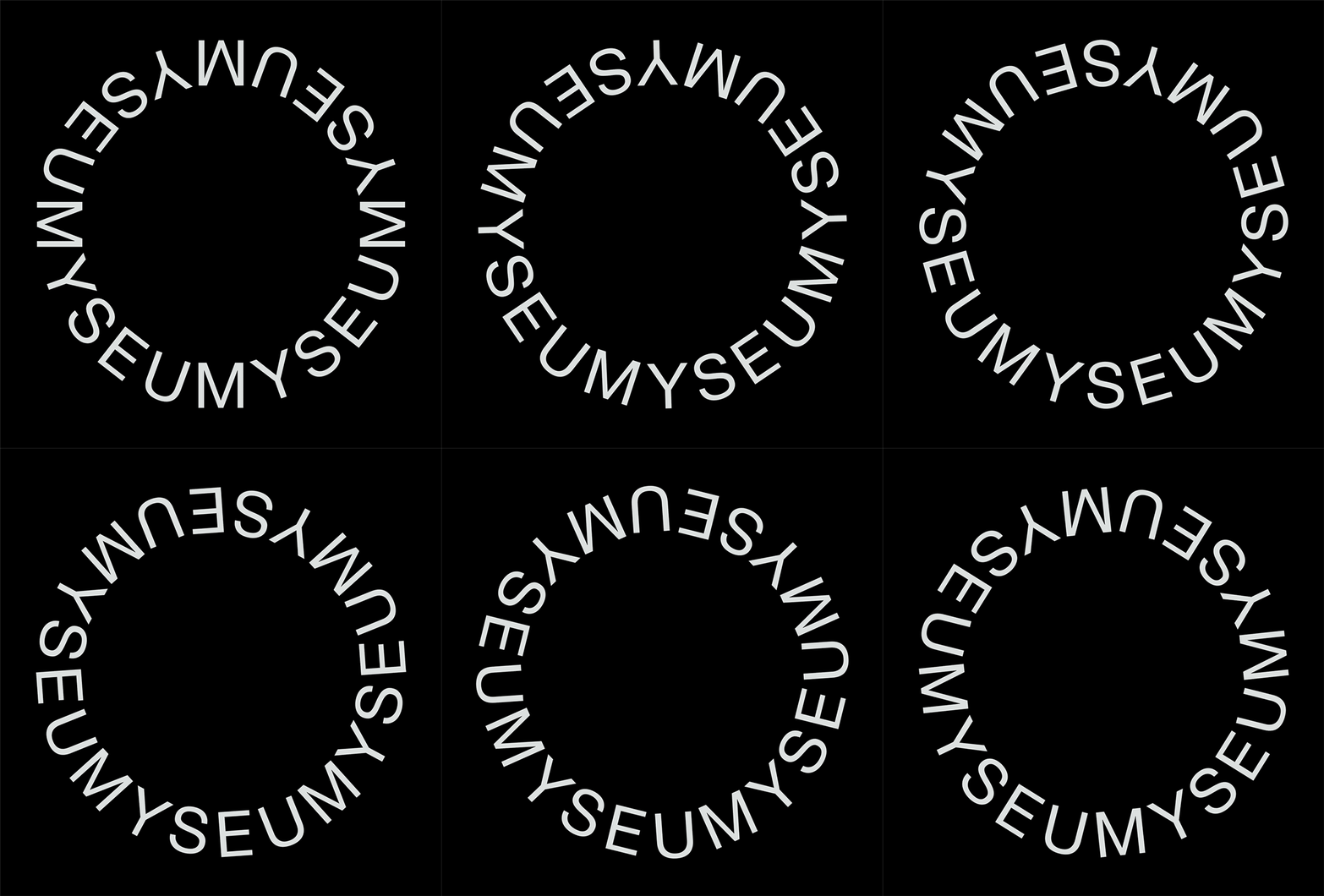
Monochromatic logo composed of white sans-serif characters arranged in a continuous circle against a black background, forming a repeating text pattern.
Summary
A monochromatic logo where white sans-serif letters spiral continuously around a circle to form a single repeating wordmark phrase, creating a cohesive, symmetrical emblem on a black field.
Visual description
White condensed sans-serif characters march clockwise around the perimeter of a perfect circle against solid black, each letter tightly kerned to the next in a seamless loop. The text reads the same phrase repeatedly as it orbits, with characters rotated to follow the circular path. The overall form is perfectly centered and balanced, with negative space filling the circle's interior. The geometric precision and uniform weight of the typeface create a rhythm that is both methodical and visually restful. No additional graphics or embellishment; pure typographic form.
Key takeaway
The technique of repeating a short phrase around a circle to create a scalable, self-contained mark that reads the same from any angle. The constraint of the circular boundary forcing letter rotation and creating natural visual rhythm. The purity of using only type with no supporting imagery, making it adaptable to any color or material.
Reuse notes
Strong choice for minimal, tech-forward, or professional brands that value precision and restraint. Works well at small sizes (favicon, app icon, seal) where the circular form provides containment. The repeating text creates a memorable, almost hypnotic mark. Not ideal for quick recognition at a glance; best when the viewer has time to read or when the brand wants to encourage close inspection. Pairs well with sans-serif typography systems.