Preview image. Unlock full-res
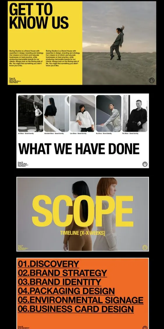
A vertical portfolio layout divided into three distinct color-blocked sections: yellow intro panel, centered grayscale grid of work samples, and orange manifesto footer.
Summary
A vertical portfolio layout divided into three distinct color-blocked sections: yellow intro panel, centered grayscale grid of work samples, and orange manifesto footer.
Visual description
The page divides into three equal horizontal sections. The top section features a vibrant yellow background with dark text ("GET TO KNOW US") and a large photograph of a person in a landscape setting. The middle section presents a 2x2 grid of black-and-white photographs against a light gray background, anchored by bold white text reading "WHAT WE HAVE DONE". The bottom section shifts to a warm orange background with dense, left-aligned sans-serif text describing the brand's scope and positioning. Each section is visually separated but unified by consistent typography weight and the warm-to-neutral color progression. The overall layout is symmetrical and structured, with clear hierarchy established through size, color, and whitespace.
Key takeaway
The three-part color blocking (yellow, neutral, orange) creates visual momentum while maintaining sophistication. The centered grid of work samples provides social proof within the portfolio narrative. The dense copy block in the orange footer establishes authority and detailed brand positioning without appearing cluttered.
Reuse notes
Effective for creative agencies, design studios, and consultancies presenting portfolio work. The yellow-to-orange warm palette reads as energetic and forward-thinking. The grayscale portfolio grid provides contrast and professionalism. Use this structure for digital portfolios or print brochures where storytelling (intro, proof, positioning) matters as much as visual work samples.
More like this


Keep what you find
A free account saves references to boards and can send you a weekly email of picks based on what you save.
To see every result, go Pro.