Preview image. Unlock full-res
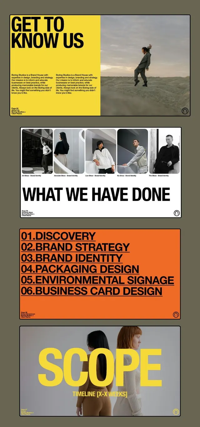
Editorial agency layout pairing color-blocked text sections (yellow, orange, white) with photography and a structured service taxonomy.
Summary
Editorial agency portfolio pairing bold color blocks (yellow headline section, orange service list) with team photography and a numbered service taxonomy, set against a warm taupe-gray background.
Visual description
A multi-panel portfolio spread with four distinct sections. Top: a bright yellow block occupying the left half holds "GET TO KNOW US" in large black sans-serif, plus two columns of small-scale body copy; the right half shows an athlete figure against a sky photograph. Second: five horizontal portrait frames showing team members or past clients in grayscale. Third: a bold orange panel lists six numbered services (Discovery, Brand Strategy, Brand Identity, Packaging Design, Environmental Signage, Business Card Design) in black condensed all-caps typeface with a plus symbol accent. Bottom: white background with large yellow-gold headline "SCOPE" and timeline copy. Warm color palette (yellow, rust, muted teal) anchors energy without chaos.
Key takeaway
The editorial rhythm of alternating text-heavy and visual-heavy blocks; the numeric service list acting as both taxonomy and visual anchor; the restraint of a three-color palette (yellow, orange, monochrome) applied as full-width blocks rather than scattered accents.
Reuse notes
Strong template for an agency site where services and process are key selling points. Works at any width by stacking sections vertically. The warm yellow-orange combo reads approachable without being playful.
More like this



Keep what you find
A free account saves references to boards and can send you a weekly email of picks based on what you save.
To see every result, go Pro.