Preview image. Unlock full-res
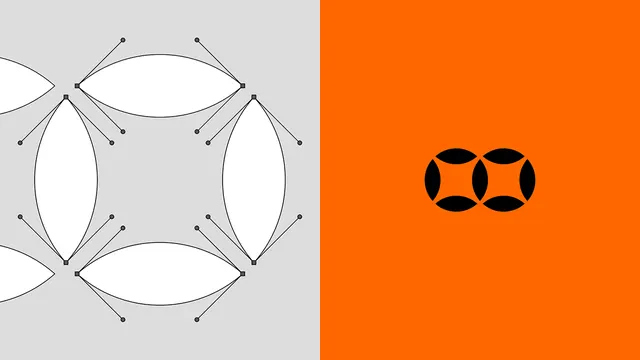
Two-panel composition contrasting a wireframe design system on the left against a pure geometric logo on the right, showing sketch to refined execution.
Summary
Two-panel composition contrasting a wireframe design system on the left against a pure geometric logo on the right, showing sketch to refined execution.
Visual description
Left panel (light gray background): overlapping eye-shaped and elongated oval outlines arranged in a loose grid, with small control-point circles and connecting lines visible, suggesting a parametric or modular design system. Right panel (vibrant orange): four intersecting black curved lens or eye shapes arranged symmetrically, forming an abstract brand mark. The stark orange-to-gray split creates visual drama and emphasizes the contrast between process (system) and product (logo).
Key takeaway
The two-panel before-and-after layout is an elegant way to show design thinking (construction lines and modules on the left, polished final form on the right); the palette shift (cool gray to hot orange) uses color contrast to reinforce the conceptual jump; the geometric eye/lens motif scales and maintains clarity whether shown as construction or solid form.
Reuse notes
Ideal for design system documentation, branding case studies, or any context needing to illustrate the relationship between foundational geometry and final mark. The orange is bold and reads best on neutral or dark backgrounds. Works well as a presentation device in pitch decks, design portfolio, or brand guidelines.
More like this



Keep what you find
A free account saves references to boards and can send you a weekly email of picks based on what you save.
To see every result, go Pro.