Preview image. Unlock full-res
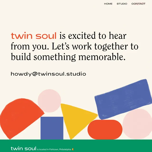
A design studio website header featuring the 'twin soul' logotype and descriptive headline, with a scatter of bold geometric shapes (circles, rectangles, triangles, a blue stripe) arranged across the lower frame and a green footer bar.
Summary
A design studio website header featuring the "twin soul" logotype and descriptive headline, with a scatter of bold geometric shapes (circles, rectangles, triangles, a blue stripe) arranged across the lower frame and a green footer bar.
Visual description
The upper third contains right-aligned navigation (HOME, STUDIO, CONTACT) in an all-caps sans-serif. Below is the headline in a mixed serif and sans-serif pairing (twin soul in a warm coral-orange with the text "is excited to hear from you. Let's work together to build something memorable" in black serif), followed by a contact email in monospace. The lower two-thirds feature loose, overlapping geometric shapes: a large half-circle (coral-red) on the left, smaller circles in muted pink, a deep-blue square and rectangle, a yellow triangle, a blue stripe, and a green footer band anchoring the bottom. The background is a warm off-white/cream. Overall color palette mixes warm oranges and reds with cool blues and a fresh forest green, creating visual tension within a soft, welcoming framework.
Key takeaway
The scattered geometric shapes function as a flexible brand system. The color palette avoids primary colors while maintaining vibrance, signaling design sophistication. The mixed serif-sans pairing (brand name in serif, supporting text in serif, inline emphasis in neon color) creates visual hierarchy without underlines or size changes. The geometric footer bar and anchor shapes could easily scale or adapt across multiple pages.
Reuse notes
Ideal for creative studios, design agencies, and creative consulting. The soft palette and "scattered" composition appeal to modern, collaborative brands. Works well for websites and marketing materials. The geometric elements feel dated if they become too regular or symmetrical. Best when the shapes overlap and feel loose, not geometric for its own sake. Green footer bar can feel restrictive if brand guidelines lock colors too tightly.