Preview image. Unlock full-res
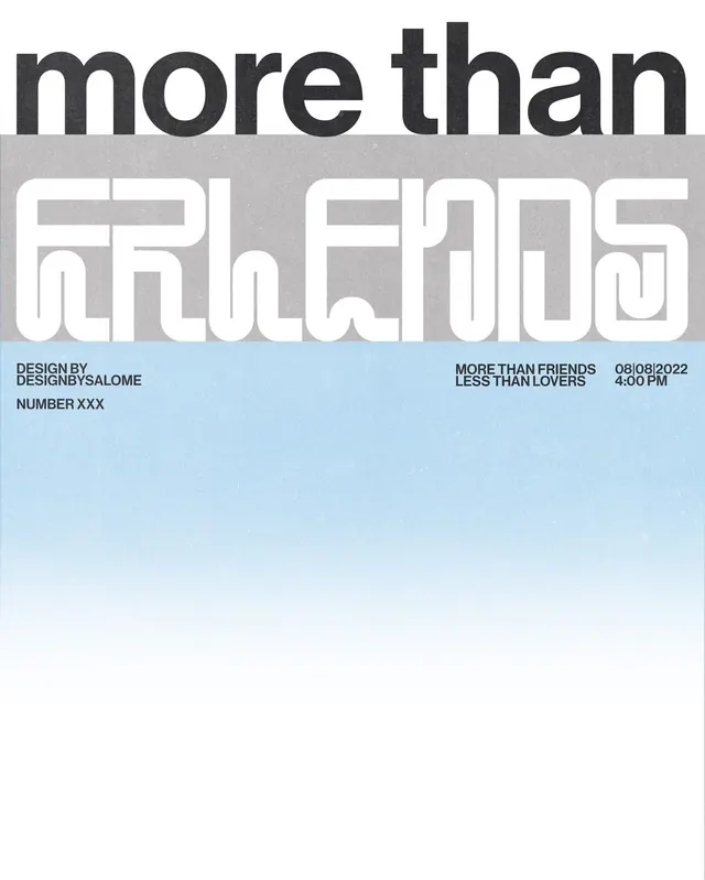
Event poster layering oversized sans-serif and outlined block letters with metadata on a bisected gray-and-blue field.
Summary
Event poster with bold oversized type split across a geometric composition: dark gray "more than" at top, white outlined letters below on mid-gray, metadata footer on light blue ground.
Visual description
The poster is divided into three horizontal zones. The top third holds a dark charcoal sans-serif word in all lowercase, set very large. The middle section spans a medium gray rectangle with white-stroked block letters forming a single word, using wide-open counters and precise outlines. The bottom strip is a pale blue-gray band anchoring small black sans-serif text: studio name, edition number, date, and time. The overall composition is stark and typographically resolute, with stark white, gray, and blue as the working palette.
Key takeaway
The combination of three distinct typographic weights and scales across a few dense, cleanly divided zones. The outlined letterforms (not filled) create a visual break from the solid sans-serif above, anchoring the composition. Using a minimal data line at the bottom (credits, date, edition) gives editorial authority without clutter.
Reuse notes
Strong template for event posters, exhibition announcements, or editorial mastheads. Works especially well when you need to establish both headline impact and publication metadata on the same surface. The monochrome palette keeps focus on type structure.
More like this







Keep what you find
A free account saves references to boards and can send you a weekly email of picks based on what you save.
To see every result, go Pro.