Preview image. Unlock full-res
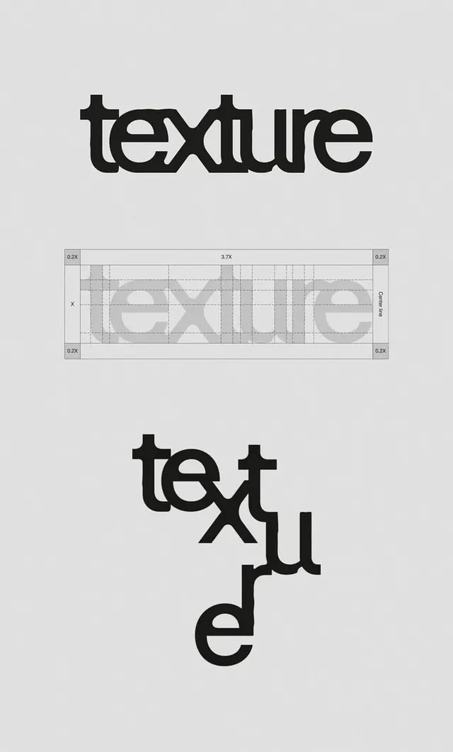
Bold geometric sans-serif 'texture' wordmark shown in three progressions: a solid statement, a detailed construction grid, and a playful rotated stacked breakdown.
Summary
Three-stage typographic exploration of "texture" in a bold geometric sans-serif, from solid wordmark to measured construction grid to a deconstructed vertical stack.
Visual description
The top third shows a solid, heavy sans-serif wordmark "texture" in black against light gray. The middle third displays the same letterforms as a construction guide with a precise grid overlay, measurement annotations (0.2X, 3.7X), and dashed internal geometry showing stroke relationships and proportions. The bottom third plays with the typeface vertically, breaking "text" into rotated lines stacked diagonally. The entire piece sits on a neutral light gray background, emphasizing the technical and experimental progression from conventional to deconstructed.
Key takeaway
The pedagogical clarity of showing a single typeface across three distinct modes (solid use, construction analysis, playful reinterpretation) teaches both how to build letterforms and how to experiment with familiar shapes. The centered grid construction explicitly reveals stroke weights and proportional relationships, useful for any custom type design brief.
Reuse notes
Excellent reference for type design documentation, design-education materials, and any project that needs to explain proportional or modular thinking. Works well in design system presentations or font specimen sheets. The playful vertical layout at bottom shows how a serious typeface can still support experimental composition.
More like this





Keep what you find
A free account saves references to boards and can send you a weekly email of picks based on what you save.
To see every result, go Pro.