Preview image. Unlock full-res
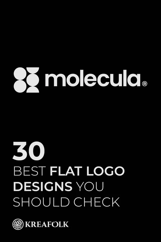
Molecula logo (four geometric circles) paired with large editorial type proclaiming best flat logo designs on black background.
Summary
Molecula brand identity (four interlocking circles) presented as the hero of an editorial layout promoting a Kreafolk design feature ("30 Best Flat Logo Designs You Should Check").
Visual description
Pure black background with white typography and mark arranged in vertical hierarchy. The Molecula logo (four filled circles arranged in a square 2x2 grid, with two circles positioned as squares) sits at top-left. Large sans-serif numerals and words "30 BEST FLAT LOGO DESIGNS YOU SHOULD CHECK" fill the center and lower third in a mix of weights and line-heights, creating strong visual rhythm. Kreafolk byline and registered trademark symbol appear at bottom. Clean centering and generous negative space reinforce editorial authority.
Key takeaway
The logo becomes a secondary graphic element in an editorial context, allowing the typography to own the stage. Mixing oversized numbers with descriptive copy creates visual interest and scanability. The layout shows how to integrate a brand mark into media design without letting it compete with the message.
Reuse notes
Use for design publications, award announcements, or collection covers. The black background and white type create maximum contrast for small digital reproductions. The layout template scales to different copy lengths. Effective when the logo is restrained and the type does the heavy communication work.
More like this







Keep what you find
A free account saves references to boards and can send you a weekly email of picks based on what you save.
To see every result, go Pro.