Preview image. Unlock full-res
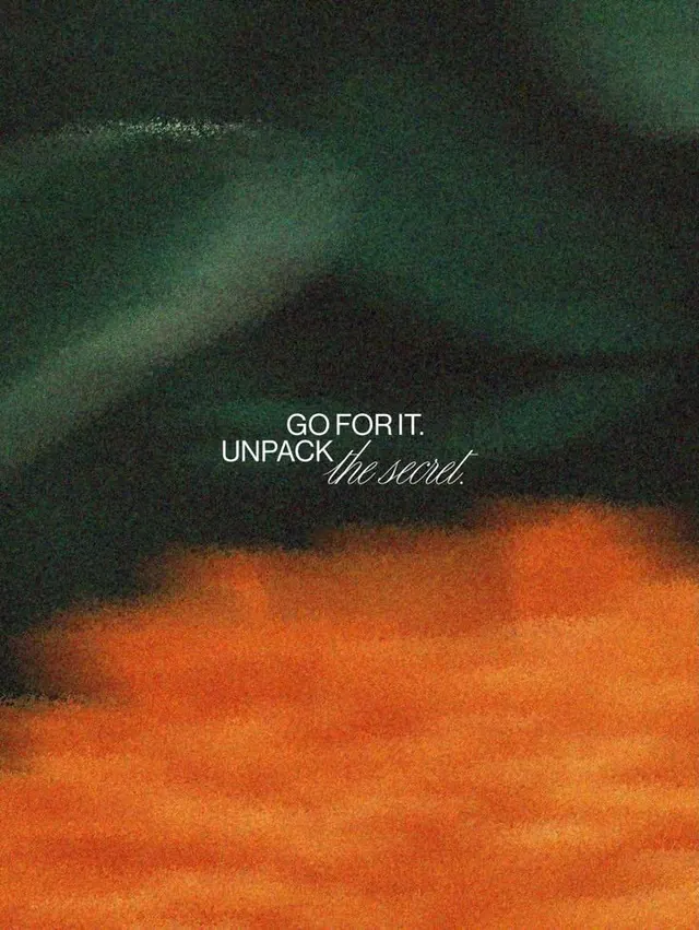
A motivational tagline set in minimal sans-serif and script against a dramatic vertical gradient, from deep teal to burnt orange, evoking movement and aspiration.
Summary
A motivational tagline in minimal sans-serif and script sits centered against a bold vertical gradient, from deep teal at top to burnt orange at bottom, creating visual momentum.
Visual description
Vertical composition split by a sweeping gradient that transitions sharply from dark teal and forest green in the upper third to burnt orange and rust tones below. Centered text sits in the teal zone: "GO FOR IT." is rendered in clean, tight sans-serif, while "UNPACK the second" blends sans and flowing, italic script typeface. The gradient itself has a textured, noisy grain that reinforces the organic, energetic mood. A subtle lens flare or light streak in the upper left adds dimension. The color split is dramatic and near-50/50, creating strong visual contrast without hard edges.
Key takeaway
The bold vertical gradient as a primary design tool, not just a background. The mix of structured type (sans) and expressive script creates personality without clutter. The texture and grain prevent the gradient from feeling flat or digital.
Reuse notes
Works well for motivational posters, brand statements, or campaign hero images where directional energy reads as optimism. The script accent softens the otherwise stark minimalism. Pair with editorial or media brands; the warmth works for consumer-facing contexts but less so for B2B corporate.
More like this




Keep what you find
A free account saves references to boards and can send you a weekly email of picks based on what you save.
To see every result, go Pro.