Preview image. Unlock full-res
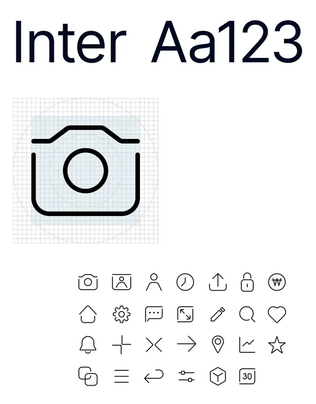
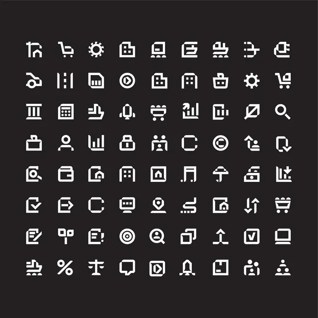
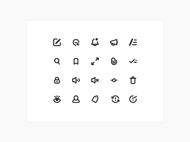
A 20-icon set of minimal line-drawn UI controls on a grid, consistent stroke weight and spacing.
Summary
A 20-icon UI kit rendered as minimal line-drawn outlines with consistent stroke weight, arranged in a 4x5 grid on an off-white background.
Visual description
The icons cover common software interface actions: edit, magnifying glass (search), bell (notification), megaphone (send), menu lines, search, bookmark, expand arrow, rounded square (link/open), checkmark, lock, volume controls (up and muted), eye (visibility toggle), trash, eye with sparkle, user profile, tag, refresh arrow, and analytics chart. Each icon uses the same thin stroke weight and is perfectly centered within its grid cell. Dark charcoal strokes on light background ensure clarity at any scale.
Key takeaway
The consistent stroke weight and grid alignment create an immediately professional, scalable system. The icon style stays functional without excessive detail, making it ideal for software dashboards, mobile apps, or admin interfaces where clarity matters.
Reuse notes
Strong reference for designing coherent icon systems in product UI. Works across web and native applications. Use as a template for maintaining consistent line weight and spacing when building custom icon sets.