Preview image. Unlock full-res
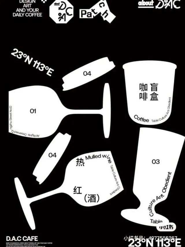
Coffee shop branding for D.A.C Cafe using stark monochrome line-art cups paired with English and Chinese labels for individual drinks and serving specifications.
Summary
Bilingual coffee menu system using minimal line-art cup illustrations numbered 01-04, with English drink names (Coffee, Mulled Wine, etc.) and Chinese variants labeled against a pure black background.
Visual description
Five stylized white line-art cups rendered on black background, each labeled with number (01, 03, 04) and descriptive text. The cups vary in shape: tall narrow forms, wide bowls, and geometric rounded silhouettes. Each vessel shows customer-facing drink names in English sans-serif (Coffee, Mulled Wine with Table Culture branding) and Chinese characters (咖啡盒, 热). Hand-drawn coordinate labels bottom-right (23°N 113°E) anchor the design geographically. Top section displays wordmark and slogan "Design Art And Your Daily Coffee" with paired geometric tagmarks, all in white serif and sans-serif type. Consistent 1-2px stroke weight maintains visual unity across varied cup profiles.
Key takeaway
Minimal line-art product system language: numbered variants in strict grid, bilingual labeling hierarchy (primary English, supporting Chinese), and pure black/white contrast that reads at any scale. The coordinate reference grounds the brand in physical place. Thin stroke line-art is extremely legible and print-ready.
Reuse notes
Effective for hospitality menus, beverage catalogs, or product specification sheets where customers need quick visual and text reference. Bilingual approach suits regional markets. Pure monochrome works well in black-and-white print, signage, and web without color management overhead.