Preview image. Unlock full-res
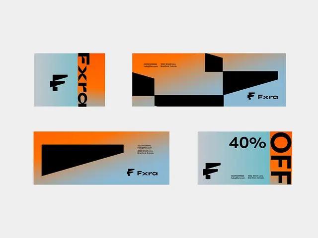
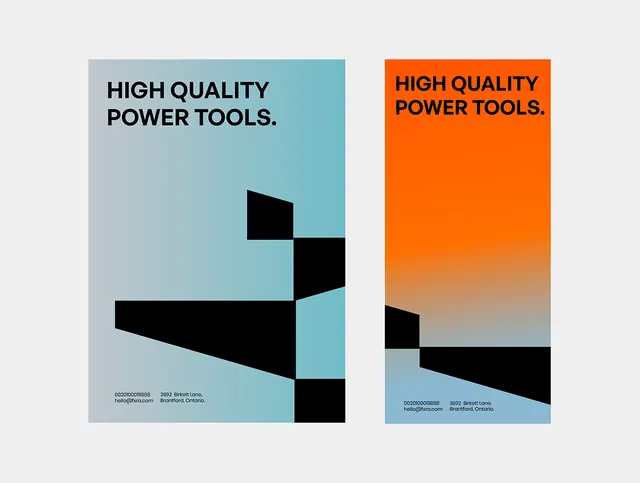
A two-panel logo design using complementary colors (teal and orange) and dynamic geometric shapes to convey precision and energy for a hardware brand.
Summary
A two-panel logo design using complementary colors (teal and orange) and dynamic geometric shapes to convey precision and energy for a hardware brand.
Visual description
Left panel features a teal background with black geometric planes arranged to suggest an abstract form or tool mark, layered at diagonal angles. Right panel shifts to bright orange fading to neutral tones at the bottom, with complementary black geometric shapes that mirror and echo the left panel's language. Both panels present the same sans-serif headline "HIGH QUALITY POWER TOOLS" in bold black capitals, positioned at the top. Small contact information (phone and address) is placed in the lower left corner on both panels. The composition creates a sense of movement through the dynamic angles and a strong brand presence through the deliberate color contrast.
Key takeaway
The use of complementary colors (teal and orange) creates visual tension and memorability without requiring a complex mark. The geometric, angled planes suggest precision and engineering while remaining abstract enough to feel modern. Splitting the design across two distinct color fields makes it adaptable for different applications and uses high contrast to ensure legibility at any scale.
Reuse notes
Strong approach for hardware, tools, or engineering brands seeking a bold, contemporary look. The geometric language works across applications: website, packaging, signage. The split-panel concept is particularly useful when you need to show product variants or pair the mark with different brand colors.