Preview image. Unlock full-res
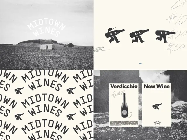
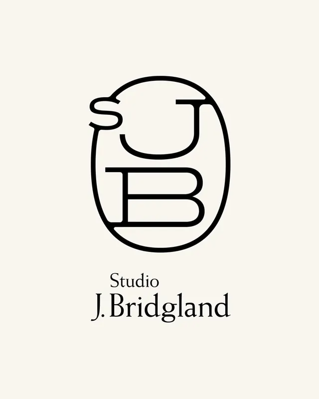
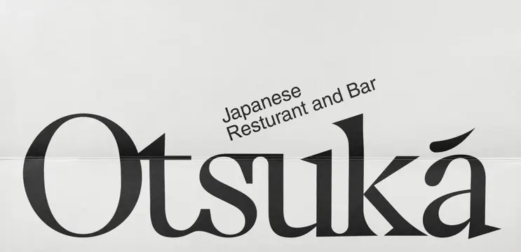
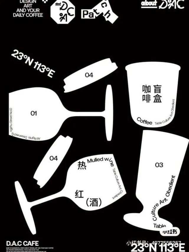
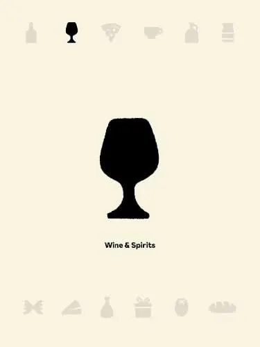
A wine-and-spirits brand mark combining an elegant serif wordmark with a sparse constellation of minimal line icons arranged in a centered composition.
Summary
A centered wine-and-spirits wordmark in black serif type on cream, paired with six minimal line-drawn icons arranged around it in a balanced, symmetrical layout.
Visual description
Black serif or mixed-serif wordmark reading "Wine & Spirits" sits at the vertical center on a warm cream background. Above and below the text, six small linear icons are arranged three-per-row: a wine glass, grape bunch, wheat bundle, herb sprig, drop, and bottle silhouette. Each icon is pure black line work, unfilled, with minimal weight and consistent proportions. Generous whitespace surrounds the composition. The overall impression is restrained, premium, and approachable.
Key takeaway
The pairing of a traditional serif wordmark with spare line-drawn supporting icons creates coherence without clutter. The symmetry around the central text acts as a subtle visual anchor. The icon set itself is reusable across menus, packaging, and signage because each symbol is self-sufficient and legible at small sizes.
Reuse notes
Strong template for premium beverage or hospitality brands seeking understated sophistication. The line icons work well for digital and print applications, and the cream-and-black palette reads as high-end across contexts. Limit this approach to categories where the subject matter (wine, spirits, tea, artisanal food) is clear enough that minimal icons suffice; it risks looking generic in unrelated verticals.