Preview image. Unlock full-res
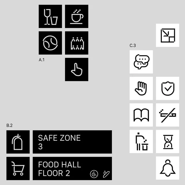
A monochrome icon and signage system built from square tiles, thin-line symbols, and labeled wayfinding blocks.

Summary
A monochrome icon and signage system built from square tiles, thin-line symbols, and labeled wayfinding blocks.
Visual description
The image shows a loose collage of black and white square icon tiles on a light gray background, arranged in a grid-like but asymmetrical composition. Several tiles contain thin-line symbols such as a glass, coffee cup, tennis ball, hand, shield, book, bell, chat bubbles, and abstract geometric marks, with a few text labels like "A.1", "B.2", "C.3", "SAFE ZONE 3", and "FOOD HALL FLOOR 2" placed beside some blocks. The icons and labels all use a stark monochrome palette and simple geometric framing.
Key takeaway
Use strict square tiles and consistent stroke weight to make a mixed icon set feel like one system. Pair pictograms with sparse, utility-style labels to give the graphics a navigational, architectural feel.
Reuse notes
Works well for wayfinding systems, brand icon libraries, campus maps, or signage-heavy environments. It is especially effective when you want the visuals to feel precise, modular, and easily expandable.
More like this





Keep what you find
A free account saves references to boards and can send you a weekly email of picks based on what you save.
To see every result, go Pro.