Preview image. Unlock full-res
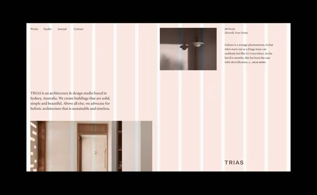
A minimal portfolio website for an architecture and design studio with a cream-and-blush color palette, grid-based layout, and serif typography showcasing architectural projects.
Summary
A portfolio site for TRIAS, a Sydney-based architecture and design studio, using a cream-and-pale-pink palette with structured grid columns and serif typography to display buildings and editorial content.
Visual description
Horizontal layout dominated by a cream background divided into white columns. Top navigation tabs (Works, Studio, Journal, Contact) in serif font sit left. A two-column content area features a moody architectural photograph of a pendant light fixture on the right, with adjacent blurred text labeled "Articles" and "Electrify Your Home". Below, body copy in serif describes the studio's philosophy: "TRIAS is an architecture & design studio based in Sydney, Australia. We create buildings that are solid, simple and beautiful." The lower third shows a second photograph of an interior doorway. The TRIAS wordmark anchors the bottom right in heavy sans-serif letters. Warm beige and grey-brown tones unify the photographic elements.
Key takeaway
The vertical white column dividers creating rhythm and breathing room on a cream background, the pairing of serif body copy with clean sans-serif headers and logo, and the use of tightly cropped architectural photography to communicate studio expertise without showing full buildings. The restraint of a two-color photo section balanced against the calm palette.
Reuse notes
Strong for creative services, architecture, interior design, or heritage brands seeking to convey quality and timelessness. The warm cream palette and serif+sans pairing work well in print or web for professional studios targeting clients who value craft and longevity. Pair with projects or case studies to demonstrate capability.
More like this




Keep what you find
A free account saves references to boards and can send you a weekly email of picks based on what you save.
To see every result, go Pro.