Preview image. Unlock full-res
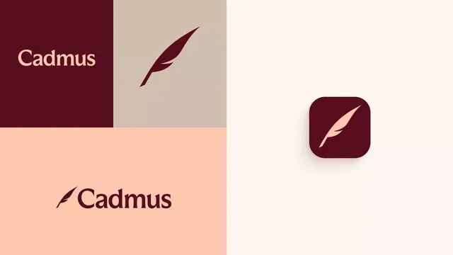
Warm-toned identity system for Cadmus featuring an organic feather icon paired with serif wordmark across split color-blocked compositions.
Summary
A warm, earthy identity system for Cadmus pairing an organic feather mark with a serif-inflected wordmark across split color-blocked backgrounds.
Visual description
Left-to-right split composition in three sections: a deep maroon rectangle with cream "Cadmus" wordmark (serif or serif-influenced); a taupe-beige panel featuring a stylized feather rendered in the same deep maroon as a diagonal slash; and a cream-white field on the right. A rounded-square app icon in the same maroon holds a smaller, simplified feather in cream, centered. Below the split, a peach-cream rectangle displays the wordmark again in dark maroon. The color palette cycles through three harmonious earth tones (maroon, taupe, peach) in a clear, modular grid system suggesting adaptability across print and digital touchpoints.
Key takeaway
The feather as both icon and pattern-breaker: simple enough to work alone but distinctive enough to anchor the brand across scales. Serif type paired with an organic, slightly irregular mark creates a luxury-meets-accessible tone. The color-blocked layout (rather than a unified background) makes each section feel intentional and allows flexible reuse of paired blocks.
Reuse notes
Strong for lifestyle, creative, or cultural brands that want warmth without casualness. The modular color blocks work well in stationary, packaging, and digital interfaces. The feather's subtle curve contrasts effectively with the geometric wordmark, so the system is strong at all sizes. Best deployed with generous whitespace to let the warm earth tones breathe.
More like this





Keep what you find
A free account saves references to boards and can send you a weekly email of picks based on what you save.
To see every result, go Pro.