Preview image. Unlock full-res
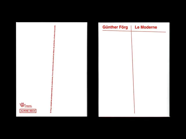
A two-page gallery catalog pairs a stacked red logo system with vertical typographic spine on the left, a minimalist dividing line, and exhibition title on the right.
Summary
A two-page gallery catalog pairs a stacked red logo system with vertical typographic spine on the left, a minimalist dividing line, and exhibition title on the right.
Visual description
Left page: white ground with a red logo stack at bottom (a small crown-like mark above "FONDATION LE CORBUSIER" and "ALMINE RECH" in red), then vertical type reading top to bottom in red monospace along the left margin. Right page: white ground with a thin red vertical line descending from top, and two lines of text: "Günther Förg | Le Moderne" in red sans-serif with a red horizontal rule separating them. Ample negative space dominates both pages.
Key takeaway
The red accent line becomes a structural element that splits the two pages and organizes information vertically. The vertical reading-spine approach for secondary type is economical and creates a distinct gallery identity. The asymmetric two-page composition, with the logo anchoring one side and the title floating on the other, conveys restraint and sophistication typical of institutional design.
Reuse notes
Excellent for museum catalogs, gallery identity, or academic publishing where precision and white space signal prestige. The red-on-white is timeless and works across print and digital. The vertical type approach is distinctly European modernist; suitable for heritage or fine-art institutions.
More like this






Keep what you find
A free account saves references to boards and can send you a weekly email of picks based on what you save.
To see every result, go Pro.