Preview image. Unlock full-res
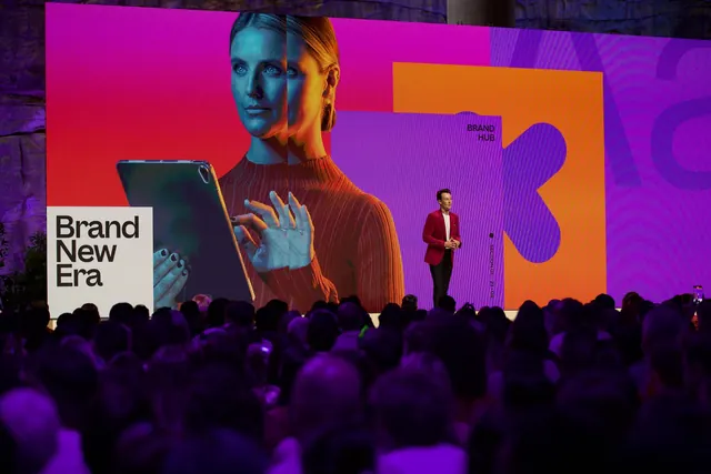
Event stage photograph of a full-width LED wall running vibrant magenta, orange and purple color blocks behind a duotone portrait and a white title card.
More like this
See all

Summary
A keynote stage shot where the identity lives entirely on one enormous LED wall, built from hard-edged magenta, orange and purple panels with a duotone portrait cut across them.
Visual description
The frame is dominated by a wide LED wall filling the upper two thirds. A portrait of a woman holding a tablet is rendered in a coarse halftone dot texture and split by vertical color bands, so her face reads teal and green on the left and orange and red on the right. To the right of her, flat rectangles of orange and purple overlap, with a large rounded purple blob letterform sitting inside the orange panel and a partially cropped outlined letter behind it. Small black all-caps type reads "BRAND HUB" above the blob, and a rotated vertical line of micro type reads "SECTION 01 - 23 - 04" beside a small filled dot. At lower left a plain white rectangle carries "Brand New Era" in heavy black grotesque, set flush left over three lines. A speaker in a bright red blazer and black trousers stands small against the wall, lit from the front. The foreground is a dense silhouette of audience heads washed in purple stage light, and rough rock walls are just visible at the top edge behind the screen.
Key takeaway
The scale contrast: one small white card of quiet black type is all it takes to anchor a wall of saturated color and texture. Splitting a single portrait into vertical duotone bands turns stock-feeling photography into an identity asset, and the halftone dot screen keeps enormous imagery from looking like a flat photo.
Reuse notes
Reach for this when planning conference or event branding where the screen is the primary brand surface and the audience sits far back. The white title card pattern is easy to systemize across sessions. Note that the palette is punishing on skin tones by design, so it needs portraits chosen for contrast rather than accuracy, and the small vertical section label is unreadable past the first few rows.
More like this





Keep what you find
A free account saves references to boards and can send you a weekly email of picks based on what you save.
To see every result, go Pro.