Preview image. Unlock full-res
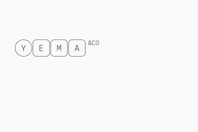
Modular logo combining a circular Y initial with square block letters spelling EMA, followed by an ampersand, forming a flexible wordmark.
Summary
Modular monogram logo combining a solid-line circular Y with three block-letter forms (E, M, A) and an ampersand, all in strict geometric proportions against white.
Visual description
A horizontal wordmark set on a light gray background. The Y appears as a filled circle with a single outline stroke. The E, M, and A are rendered as connected squares and rectangles with outer strokes only, forming geometric letterforms. An ampersand symbol sits to the right, slightly smaller. All forms align to a baseline, creating a cohesive horizontal rhythm. Black stroke weight is consistent throughout. The system demonstrates how each component can function independently or as a unified mark.
Key takeaway
The modular philosophy makes this logo work both as a complete unit and as separable components. The stroke/filled contrast between the Y and the block letters creates visual hierarchy without scale change. The consistent geometric constraint makes it work at any size while remaining legible.
Reuse notes
Ideal for brands needing flexibility across applications, from favicon to stationery. The simplicity suits corporate and creative sectors equally. Works best in monochrome; the geometric approach would be harder to extend into color without losing its precision.