Preview image. Unlock full-res
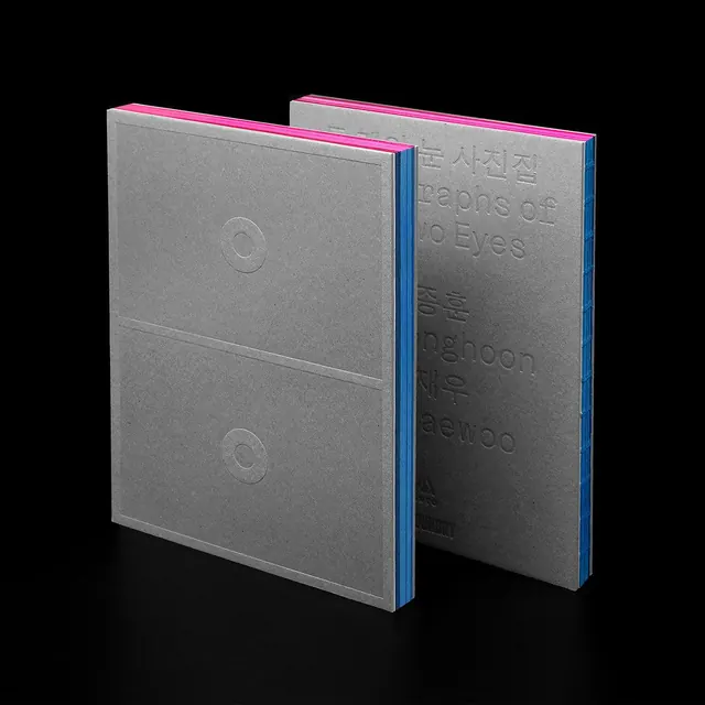
Two identical matte-gray book covers with debossed typography, bright pink spine edges, and side-by-side presentation showing front and back variations.
Summary
A pair of matching matte-gray book covers with subtle debossed typography, linked by a bright pink spine edge and presented in three-quarter view to show both front cover and back cover design.
Visual description
Two identical books positioned side-by-side against a black background, photographed to display front and back covers. Matte gray covers with carefully debossed sans-serif text creating subtle surface variation, visible only where light catches the relief. A vibrant hot-pink edge stain runs along the spine and visible edges, providing stark contrast. The composition emphasizes the tactile, archival quality of the binding and the precision of the embossed typography, which is legible only through light and shadow rather than color.
Key takeaway
Debossing provides visual and tactile interest without ink, creating an intellectual, refined feel suitable for serious publishers. The hot-pink edge stain is a small luxury that reads memorable without overwhelming the muted palette. Showing both front and back covers in the product photography communicates the completeness and symmetry of the design system.
Reuse notes
Strong for literary publishing, nonprofit reports, and premium gift editions where craft and quiet sophistication matter. The matte gray requires high-quality printing to avoid dullness. The pink edge works because it's restrained and unexpected; overuse would cheapen the effect. Works especially well when the back cover mirrors the front.
More like this





Keep what you find
A free account saves references to boards and can send you a weekly email of picks based on what you save.
To see every result, go Pro.