Preview image. Unlock full-res
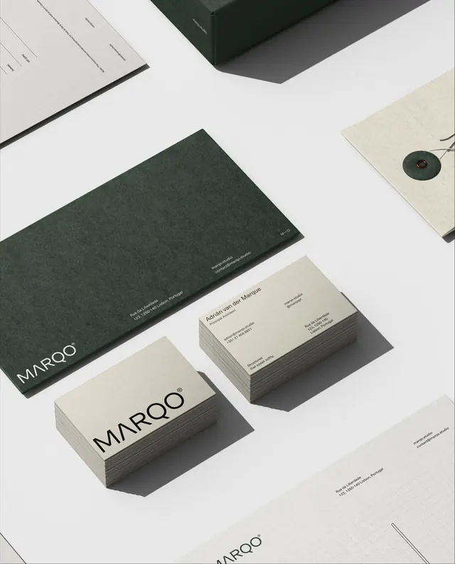
Minimal brand identity mockup showing dark green and cream stationery suite with clean sans-serif logotype and field of matte finishes.
Summary
Flat-lay mockup of a complete brand system for "Maroo" rendered in matte dark green, cream, and gray stationery pieces, including business cards, envelopes, and a branded box on white background.
Visual description
Overhead view of stacked and scattered printed collateral: kraft/cream business cards bearing the word "MAROO" in tight, modern sans-serif; a dark forest-green letterhead or envelope marked only with the mark; a cream cardboard box top with a small dark-green circular seal; and a light cream or off-white secondary card with fine dark text. All pieces feature matte finishes with subtle shadows suggesting depth. Clean sans-serif typography is minimal and aligned. The color palette—forest green, cream, light gray, and white—evokes restraint and premium quality through material texture rather than embellishment.
Key takeaway
The restraint of a monochromatic palette with only dark green as accent. Using texture and finish (matte, uncoated cardstock) to convey luxury instead of gloss or foil. The tightly-spaced sans-serif justification and negative space on cards.
Reuse notes
Ideal for brands seeking understated, craft-forward positioning (boutique retail, premium goods, architecture, fine dining). The dark green reads sophisticated and slightly unconventional. Cream and green can feel either heritage or contemporary depending on kerning and weight of type; here it leans contemporary. Works best with high-quality print production.
More like this


Keep what you find
A free account saves references to boards and can send you a weekly email of picks based on what you save.
To see every result, go Pro.