Preview image. Unlock full-res
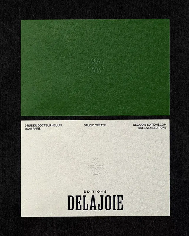
A publishing house identity split into two materials: deep olive green French fold wrapping a cream interior cover with sans-serif contact information and a delicate geometric logo mark.
Summary
A publishing house identity split into two materials: deep olive green French fold wrapping a cream interior cover with sans-serif contact information and a delicate geometric logo mark.
Visual description
Two-part book cover shown open. Upper half is a deep olive green front cover panel with a small embossed or faint monogram centered. Lower half reveals the cream interior with three aligned columns of sans-serif text in black: studio address, "STUDIO CREATIF", and website information. The main brand name "DELAJOIE" in bold sans-serif anchors the center bottom. A matching geometric mark appears on both halves. The color contrast between forest green and natural cream is stark and sophisticated.
Key takeaway
The compositional split between visual (green panel) and typographic (cream panel) that transforms an identity across a single object. The minimal geometric mark that unifies both surfaces. The restraint of using only sans-serif, black, and two distinct paper colors to convey refinement and editorial craft.
Reuse notes
Ideal for high-end publishing, design studios, or craft-focused brands where tactile material choice is as important as typography. Works especially well when you have two complementary paper stocks and can commit to a single geometric symbol.
More like this





Keep what you find
A free account saves references to boards and can send you a weekly email of picks based on what you save.
To see every result, go Pro.