Preview image. Unlock full-res
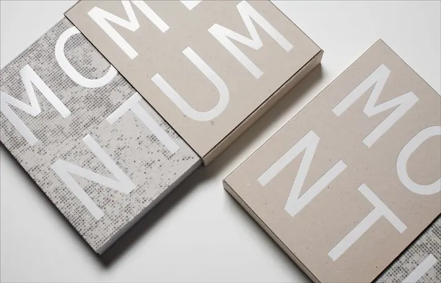
Stacked kraft-paper boxes with chunky display type, overlapped at angles to reveal textured underlayers and create dimensional shadow play.
Summary
A typographic specimen showcasing chunky uppercase letterforms printed on natural kraft boxes, angled to reveal texture and cast strong shadows that add architectural depth.
Visual description
Three rectangular kraft-paper boxes, each featuring large white sans-serif uppercase letters, are photographed at overlapping angles against a soft white background. The paper itself reads warm beige to gray-tan, and its visible grain and texture is evident especially on the tilted box face on the left. Crisp drop shadows beneath each box reinforce the dimensional arrangement. The typography is bold, heavily weighted, with rounded terminals on curves. The minimal color palette relies entirely on paper tone, white text, and shadow gradation to create visual interest without color variation.
Key takeaway
The angled overlap of identical forms creating dimensional composition from flat typography. The subtle texture variation within the monochromatic palette. The use of cast shadows as the primary depth cue, avoiding any other visual flourish.
Reuse notes
Effective for packaging and stationery branding that emphasizes tactile, craft-forward identity. The approach suits luxury or artisanal goods where material honesty is key. Works well as a template for type-specimen or foundry presentations. The angled-stack layout can extend to physical box packaging, business cards, or letterpress applications.
More like this



Keep what you find
A free account saves references to boards and can send you a weekly email of picks based on what you save.
To see every result, go Pro.