Preview image. Unlock full-res
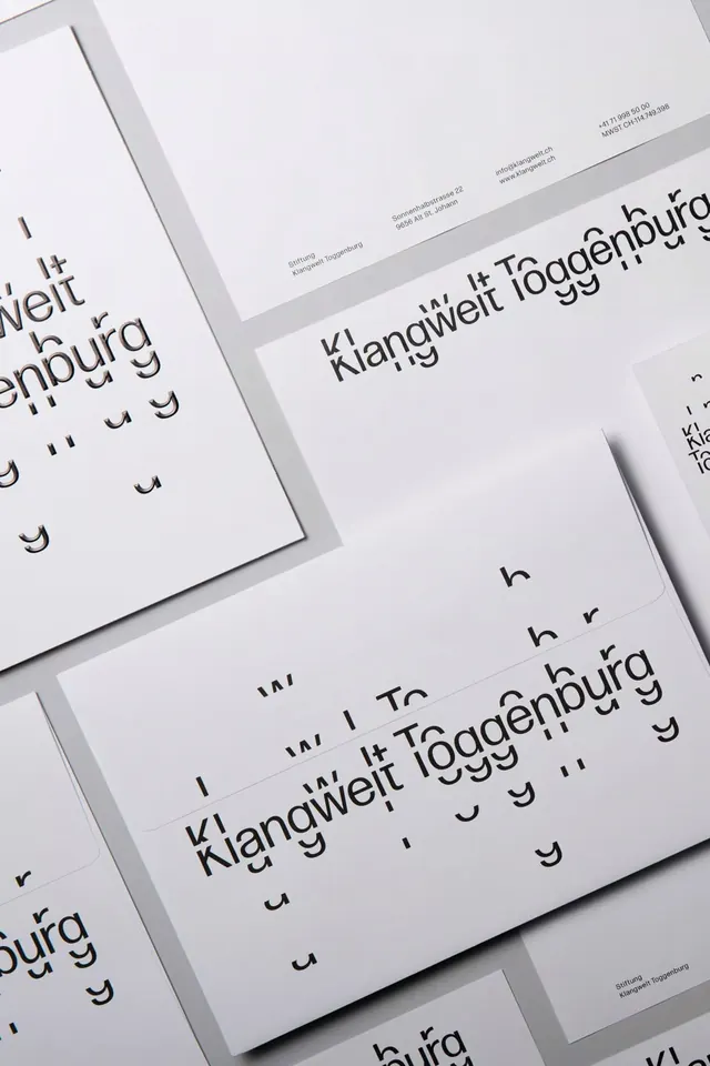
Stationery system for Klangwelt Foggenburg using overlapping white cards, monochromatic palette, and experimental sans-serif typography to create a structured, editorial identity.
Summary
Stationery presentation for Klangwelt Foggenburg featuring overlapping white cards and monochromatic typography, establishing a high-end, structurally disciplined identity through restraint and precision.
Visual description
Angled photograph of printed stationery items—business cards or notecards—arranged in overlapping layers. The wordmark "Klangwelt Foggenburg" appears across multiple cards, set in a modern, slightly stylized sans-serif with experimental letterforms. Text and branding appear in dark charcoal or black on bright white card stock. Contact and address information is visible on some cards in much smaller sans-serif type. The composition emphasizes the white cards' clean edges and the shadows cast between overlapping layers. No color or illustration—the entire palette is white, cream, light gray, and dark gray.
Key takeaway
Overlapping cards as a way to show multiple touch-points (business card, letterhead, secondary card) while maintaining a single visual voice. The experimental, slightly quirky sans-serif gives the identity personality without breaking the minimal aesthetic. Precise alignment and generous white space make the typography hierarchy feel intentional and considered, suitable for a high-end creative or cultural institution.
Reuse notes
Best for design studios, cultural organizations, or service-based brands where sophistication and precision signal quality. The monochromatic treatment requires excellent typography to carry the identity—test the typeface across sizes and formats before committing. The overlapping-card mockup is useful for presenting stationery systems but requires good photography and lighting to convey the subtlety of the design. Works well in portfolios and case studies.
More like this




Keep what you find
A free account saves references to boards and can send you a weekly email of picks based on what you save.
To see every result, go Pro.