Preview image. Unlock full-res
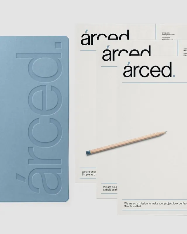
Arced brand identity system showcasing a muted blue embossed wordmark on a kraft notebook with coordinated typographic collateral and natural wood pencil.
Summary
Arced is a design-focused brand with a restrained identity system: a muted blue embossed mark on kraft covers, paired with clean sans-serif logotype and subtle typographic emphasis through underlines and color call-outs.
Visual description
A split layout shows the embossed notebook on the left in soft blue (with an iterative stack of circular mark variations) and the stationery suite on the right. The wordmark "arced" appears three times, each rendered in a bold sans-serif with a horizontal underline in the same blue. Below sits a natural wood pencil and supporting text in a smaller serif font. The palette is restrained: cream, warm gray, muted blue, and black. Ample white space and left-edge vertical dividers create a measured, systematic feel.
Key takeaway
The embossed mark working as texture without color. The paired underline as a typographic hierarchy device, repeated across multiple scale sizes. The restraint of a single accent color grounding an otherwise monochrome suite.
Reuse notes
Works for professional services, design studios, and premium retail. The embossed texture reads as craft and care; scale the approach to paper weight and finish. Effective on kraft, uncoated, or natural stock.
More like this


Keep what you find
A free account saves references to boards and can send you a weekly email of picks based on what you save.
To see every result, go Pro.