Preview image. Unlock full-res
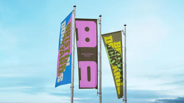
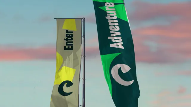
Two tall brand flags photographed against a pink and blue dusk sky, one sand and yellow reading "Enter", one green reading "Adventure".
More like this
See all

Summary
Two brand flags shot from below against a dusk sky, each carrying one word set vertically plus an oversized crescent monogram cropped by the flag edge.
Visual description
The left flag is a flat sand-khaki banner on a straight pole, with acid-yellow angular patches at top and middle and a dark green crescent monogram at the bottom that runs off the right edge. Its single word "Enter" is set in heavy dark green display type, rotated to read bottom to top. The right flag is a taller curved feather banner in deep forest green, with bright green wedge shapes at the top and around the mark, and a cream crescent monogram sitting low and bleeding off both sides. Its word "Adventure" is cream, same rotated setting, larger and distorted by the fabric's curve. Behind them a pale blue sky carries salmon-pink cloud streaks. Both flags show soft creases and slight wind bend, and the pole hardware is visible on the left banner.
Key takeaway
One word plus one cropped monogram per flag is enough at a distance, and letting the mark bleed off the edge makes a small flag feel like a fragment of something bigger. Running two different flag shapes and two different colorways off the same two elements keeps the pair varied without adding vocabulary.
Reuse notes
A good model for entrance, festival and trail flag sets where each banner must work alone from far away. The rotated single word only survives on tall narrow formats. Distortion from fabric curve is part of the charm here, but pick a display face with sturdy enough strokes to survive it.