Preview image. Unlock full-res
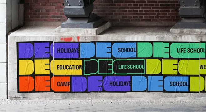
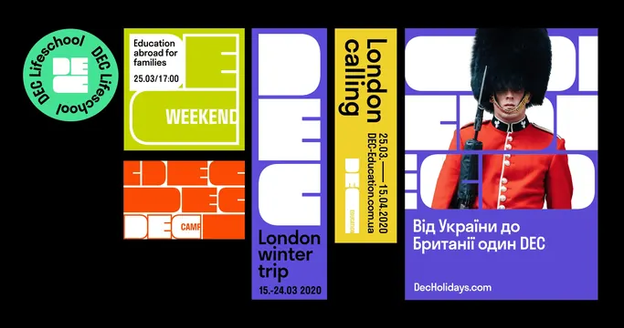
Street mockup of a long wheatpaste band where the DEC monogram tiles in eight colors, each repeat naming a different sub-brand.
More like this
See all

Summary
A photographed run of pasted posters along a concrete plinth, tiling the DEC monogram three rows deep so the repeated mark becomes a horizontal pattern rather than a set of separate posters.
Visual description
The camera looks along a stone base under a red brick facade with two dark cast iron column feet above. Across the plinth a continuous black band of pasted paper carries the monogram repeated in three rows and roughly five columns, each repeat in a different flat color: violet, sky blue, mint green, yellow, acid yellow-green and orange, plus one repeat drawn as a green outline on black. Sub-brand words sit in black inside the wide counter of each C, reading HOLIDAYS, SCHOOL, LIFE SCHOOL, EDUCATION, CAMP and WE, cut off at the frame edges. The paper shows real wrinkles, seams between sheets and a red spray mark bleeding through at the top left; grey paving fills the foreground.
Key takeaway
Repetition doing the work of scale: no single poster is large, but tiling the same monogram in shifting colors turns a low plinth into a wall-length brand statement, and each tile still carries a different service name.
Reuse notes
Reach for this when an identity must present many sub-brands at once in public space, or when a mark is strong enough to survive being read as pattern. The in-situ paper texture and imperfect seams are what keep it from looking like a flat vector board; a clean render would lose that.
More like this




Keep what you find
A free account saves references to boards and can send you a weekly email of picks based on what you save.
To see every result, go Pro.