Preview image. Unlock full-res
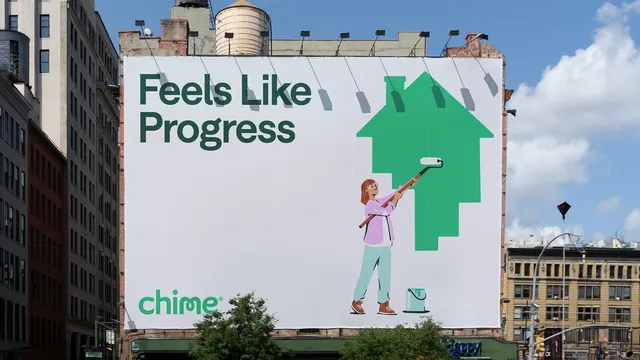
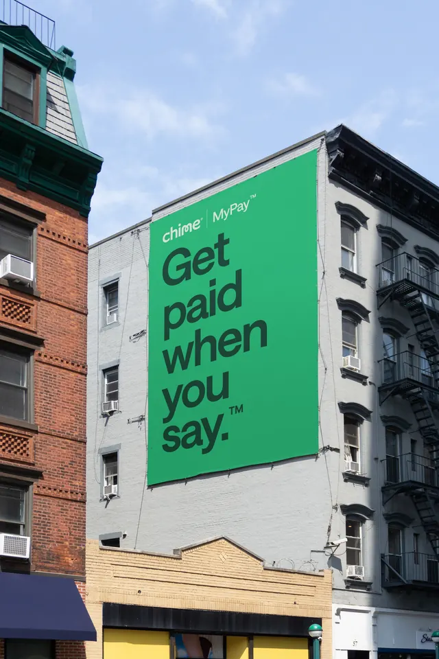
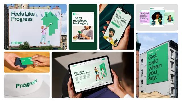
Grid collage of Chime brand applications spanning billboards, social ads, a debit card, embroidered merchandise, web and a painted wall banner.
More like this
See all

Summary
A single-frame overview of one fintech identity in use, laid out as an uneven grid of eight application shots that all resolve to the same green, the same rounded sans and the same flat character illustration.
Visual description
Eight panels of varying size sit on white with generous white gutters. Top left is a street billboard reading "Feels Like Progress" in dark green over white, with a flat-illustrated figure rolling a green house shape onto the board and the lowercase wordmark below. Next to it a dark green tile holds a white social card, "The #1 most loved banking app.", with a photo of a woman holding a green phone and a small "Zero Fees" pill. A third panel is a close photograph of a hand holding a phone whose green screen shows a MyPay waitlist message and a bearded character illustration. Top right, a grey tile stacks three overlapping social posts in pink, green and white. Lower left, a photograph of a green Visa card being tapped on a reader over a wooden table, then a cream cap with "Progress" embroidered in green thread, the letter O replaced by a small mark. The large centre panel is a tablet held in two hands showing a light green website hero, "Get paid when you say.", illustrated family scene, a Learn More button and a row of press logos. The right column ends with a tall photograph of a green painted wall banner on a grey brick building.
Key takeaway
One saturated green plus one flat illustration style is enough to hold eight completely different media together, from a knitted cap to a five-storey wall. The collage sequences scale deliberately, moving from citywide out-of-home down to a stitched logo, so the system reads as complete rather than as a sampler.
Reuse notes
Good reference for a single-slide identity summary in a case study or pitch deck where you need to prove range without one application per page. The uneven grid depends on white gutters and consistent corner radii to stay calm; drop the gutters and it collapses into noise. Works best when the palette is narrow enough that the panels read as one family.