Preview image. Unlock full-res
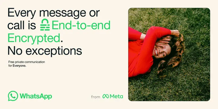
Cream campaign layout pairing a four-line headline that swaps a lock glyph in mid-sentence with a rounded photo panel and a green logo lockup.
More like this
See all
Summary
A wide, cream campaign frame in which the privacy message is carried by a four-line headline that switches from black to green at the phrase it wants to own, with a lock glyph set inline as if it were a letter.
Visual description
The canvas is a warm cream field split roughly two thirds to one third. On the left, a headline in a geometric sans runs four lines deep: "Every message or call is" in near-black, then a small green padlock glyph sitting on the baseline directly in the type stream, followed by "End-to-end Encrypted." in bright green, then "No exceptions" back in near-black. A two-line support caption in small type sits beneath, with one word bolded. The bottom left carries the WhatsApp speech-bubble mark and wordmark in the same green, and a quiet "from Meta" endorsement line in dark grey sits mid-baseline with the Meta infinity mark. On the right, a rounded-corner photo panel shows a woman in a red long-sleeve top lying on grass, eyes closed and smiling, one arm across her face, shot top-down so the grass fills the frame edge to edge. Generous margins on all four sides; nothing is boxed or ruled.
Key takeaway
Substituting an icon for a word inside a running headline keeps the message a single sentence instead of a headline plus a badge. The two-tone headline does the emphasis work that bolding or a highlight box would otherwise need, and the red garment is the only colour that competes with the brand green, which is what stops the photo from reading as a stock filler.
Reuse notes
Good template for a product-truth campaign line that needs one claim to land hard, especially in wide out-of-home or paid-social ratios. The inline glyph only works when the icon is simple enough to read at cap height, and the cream ground is doing a lot to keep saturated green from feeling like a UI colour. Pair with a single warm photo rather than a set.