Preview image. Unlock full-res
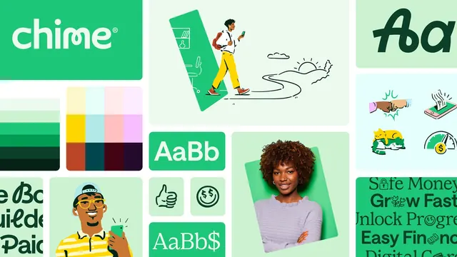
A tiled overview of the Chime identity showing the wordmark, two color ranges, three type styles, illustration, icons and photography in one green mosaic.
More like this
See all
Summary
A single board that lays the whole Chime toolkit out as rounded tiles, so the wordmark, palettes, type, illustration, icons and photography can be read as one green system at a glance.
Visual description
Tiles of different sizes sit on a pale mint field, each with generous rounded corners. Top left is a mid-green tile holding the lowercase "chime" wordmark in white, with a rounded geometric sans whose i-dot sits close and a small registered mark. Below it two swatch blocks: a five-step green ramp from pale to near-black, and a twelve-cell grid of secondary colors including yellow, ice blue, blush pink, lilac, rust, navy and deep plum. The center column runs a large spot illustration of a person walking off a tilted green card along a hand-drawn winding path toward a line-drawn sunrise, then two type tiles reading "AaBb" in a sturdy sans and in a contrasting serif, plus two square icon tiles with a thumbs-up and a dollar-eyed smiley in single-weight line art. The right column shows a dark green script-like "Aa", a pale blue tile of four line icons (a fist bump, a hand reaching into a phone, a sleeping cat, a savings gauge), and a green tile of stacked headline phrases where icons replace letters. Lower center is a cutout photograph of a smiling woman in a lilac sweater on a tilted green card, and lower left a cropped tile of green lettering samples.
Key takeaway
Building the whole overview from one hue plus a wide secondary palette proves the system holds together before any single asset does. Tiling illustration, icons, type and photography at similar scale shows how the ingredients coexist, and the tilted green card recurring under both the illustrated figure and the photographed one is the device that ties two very different image styles together.
Reuse notes
A strong template for a brand summary slide, a case study opener or the first page of a guideline deck. Works best when the identity really is dominated by one color, otherwise the mosaic loses its unity. Needs enough finished assets to fill every tile; half-built systems look thin in this format.
More like this

Keep what you find
A free account saves references to boards and can send you a weekly email of picks based on what you save.
To see every result, go Pro.