Preview image. Unlock full-res
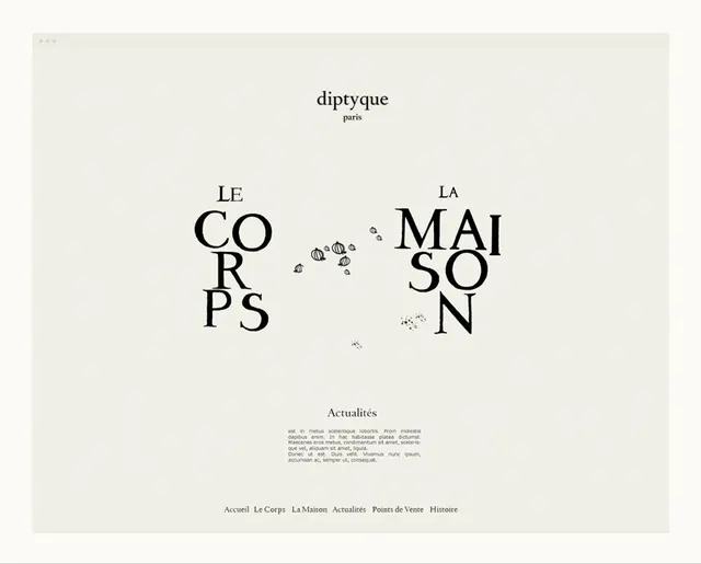
Web layout for Parisian luxury brand featuring centered serif headline broken across two columns with decorative botanical icons and ample white space.
Summary
Web homepage for diptyque, a Paris-based luxury fragrance and home-goods brand, using a high-end minimalist layout centered on serif typography with deliberate white space.
Visual description
A pale off-white background fills a large browser window. At the top is the brand name "diptyque" in small sans-serif, followed by "paris" in even smaller type. Below, the headline "LE CORPS" and "LA MAISON" are stacked in a serif typeface (likely serif display cut), splitting across two columns with deliberate space between. Tiny decorative botanical icons (appears to be stylized plants or botanical ornaments) float in the negative space between the two halves. Lower down, a smaller "Actualités" subheading introduces body text in a smaller serif. At the bottom, a horizontal navigation menu lists sections: Accueil, Le Corps, La Maison, Actualités, Points de Vente, Histoire.
Key takeaway
The split-column wordmark treatment using breathing room rather than proximity to imply relation. Tiny ornamental details (botanical icons) that add personality without clutter. The restrained color palette and generous white space creating an unmistakably premium feel. The serif typographic hierarchy from display-size headlines down to readable body.
Reuse notes
Excellent reference for luxury goods, beauty, fashion, or high-end lifestyle branding. The type-forward approach works best when the brand name and core message are strong enough to carry the visual. Pairs well with minimalist photography or product-focus storytelling.
More like this




Keep what you find
A free account saves references to boards and can send you a weekly email of picks based on what you save.
To see every result, go Pro.