Preview image. Unlock full-res
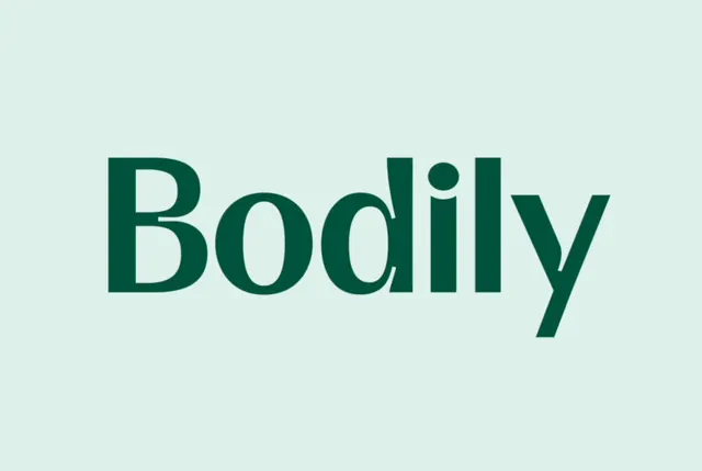
The wordmark Bodily set in a high-contrast serif display face, deep forest green on a pale mint field, with a distinctive angled tail on the y.
Summary
A single centered wordmark, Bodily, rendered in a high-contrast serif display typeface in deep forest green on a pale desaturated-mint field. The defining detail is the sharply angled, sheared tail on the lowercase y that gives an otherwise classical letterform a modern cut.
Visual description
The logotype sits dead-center with wide negative space on all sides and nothing else in frame. The face is a serif with pronounced thick-thin contrast: the B and the bowls of o and d carry weighty vertical stems and fine bracketed serifs, while the dot of the i is a clean circle. The y breaks the rhythm with a straight diagonal tail clipped at a flat angle rather than curled. The color story is strictly tonal: a roughly #00523C green type on a soft mint ground around #DDF0EA, a quiet two-tone monochrome with no accent.
Key takeaway
The sheared, flat-angled y tail as a single ownable quirk in an otherwise traditional serif, a low-effort way to make a stock-feeling face look bespoke. The tone-on-tone green-on-mint pairing reads soft and premium without any contrast drama. Centering the wordmark in vast empty space lets the letterforms themselves do all the work.
Reuse notes
Reach for this for a wellness, beauty, or healthcare brand wanting calm and editorial rather than clinical. The tonal palette is gentle but low-contrast, so pair it with a darker green for body text and CTAs where legibility matters. Works on packaging and soft photographic backgrounds; less suited to dense UI.
More like this





Keep what you find
A free account saves references to boards and can send you a weekly email of picks based on what you save.
To see every result, go Pro.