Preview image. Unlock full-res
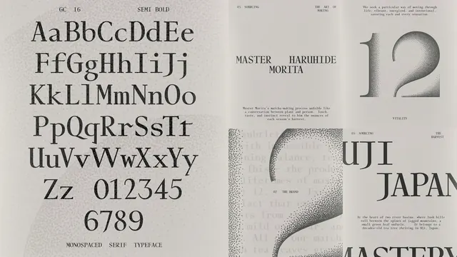
A black-and-white identity presentation combines a monospaced serif type specimen with editorial page layouts featuring stippled gradients and Japanese tea-related copy.
Summary
A wide identity board pairs a full character set for "GC 16 SEMI BOLD" with multiple editorial layouts that use grainy stippled forms and high-contrast serif headlines.
Visual description
The left panel shows uppercase, lowercase, and numerals for a monospaced serif face labeled at top and bottom. The right side holds four smaller spreads on warm off-white paper: one introduces "MASTER HARUHIDE MORITA" under "THE ART OF MAKING", another features a large stippled numeral "12" with "VITALITY" below, a third zooms into a curved stipple mass over faint background type, and a fourth highlights "UJI JAPAN" with harvest copy. Black ink, generous margins, and mixed display-and-body hierarchy repeat across the set.
Key takeaway
Stippled gradients give an artisanal materiality to an otherwise restrained serif system, letting texture carry brand warmth while type stays editorial and precise.
Reuse notes
Strong reference for premium food or craft brand guidelines, type-specimen pages, and monochrome identity decks that need tactile print texture without color. Useful when pairing heritage copy with modern layout grids.
More like this


Keep what you find
A free account saves references to boards and can send you a weekly email of picks based on what you save.
To see every result, go Pro.