Preview image. Unlock full-res
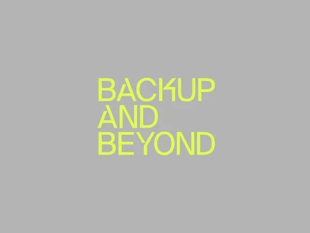
A sans-serif type specimen in bright chartreuse against a medium gray background, demonstrating bold, all-caps word breaks across three lines.
Summary
A condensed, all-caps sans-serif wordmark in bright lime-green type stacked across three centered lines on a neutral gray field.
Visual description
Centered on a uniform medium gray background, bright chartreuse-yellow all-caps letters spell "BACKUP AND BEYOND" stacked vertically and left-aligned within the composition. The typeface is a geometric, condensed sans-serif with tight letter-spacing and clean straight terminals. The three lines break naturally at word boundaries, with "BACKUP" and "AND" each on their own line, creating a compact rectangular text block. The stark high-contrast between the electric neon-green type and the quiet gray field creates immediate visual tension and draws focus to the word itself.
Key takeaway
The power of extreme type contrast without any secondary design elements; the use of word breaks to control reading rhythm and emphasis; the compressed geometric font weight lending confidence and technical authority.
Reuse notes
Ideal for software, SaaS, infrastructure, or developer-facing brands that need to communicate seriousness and forward motion. The bright green on gray reads as dependable yet energetic. The all-caps all-type composition signals no-nonsense efficiency. The broken line arrangement is restrained and scannable, avoiding the visual chaos that stacked type can create. Works at all scales; the geometric construction remains legible even at small sizes.
More like this



Keep what you find
A free account saves references to boards and can send you a weekly email of picks based on what you save.
To see every result, go Pro.