Preview image. Unlock full-res
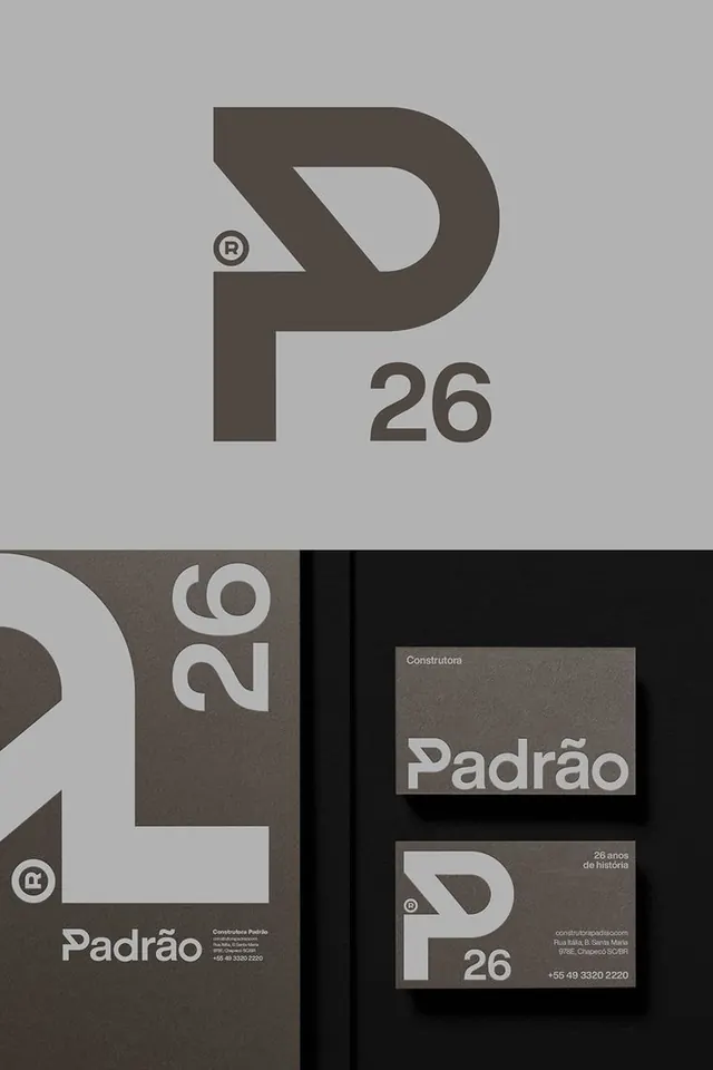
Brazilian design firm identity featuring a geometric P mark and matching set of collateral—logo lockup, stationery, and business cards—in warm gray and black.
Summary
Brazilian design firm identity featuring a geometric P mark and matching set of collateral—logo lockup, stationery, and business cards—in warm gray and black.
Visual description
The top half shows the primary mark: a bold capital P made of two rounded geometric shapes, with a registered trademark symbol below and the numeral "26" at the right. The bottom half displays system applications: a dark brown vertical band on the left showing the full lockup with "Padrão" stacked and a registered mark, alongside a business card in charcoal with white text. The card shows the mark, brand name "Padrão", and fine-print contact details (address, phone). All typography is modern sans-serif, left-aligned in white or light gray on dark grounds. The palette moves from light warm gray (mark background) to dark charcoal (stationery), unifying through geometry and consistent type weight.
Key takeaway
Geometric letterforms as the core brand anchor (P built from basic shapes); scaling the mark consistently across lockup, stationery, and cards; single color application to stationery (white ink on dark field) for production efficiency and impact.
Reuse notes
Effective for construction, real-estate, and B2B professional services where established heritage and geometric confidence matter. The mark's modularity allows flexible application across signage, vehicles, and large-scale collateral. Works best on dark backgrounds; invert with white text for print economy.
More like this





Keep what you find
A free account saves references to boards and can send you a weekly email of picks based on what you save.
To see every result, go Pro.