Preview image. Unlock full-res
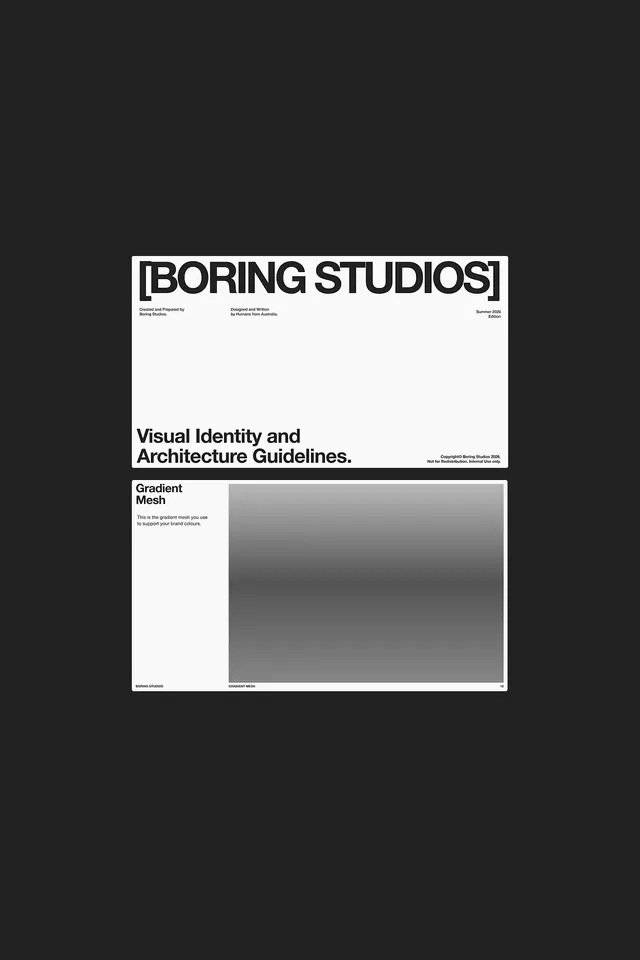
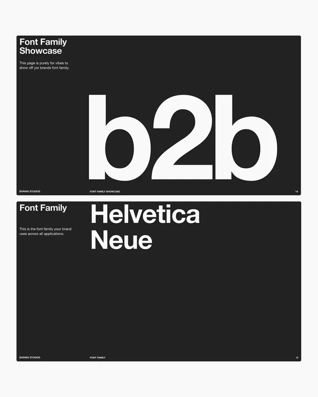
Brutalist brand guidelines for BORING STUDIOS featuring bold black headline typography on white, Swiss grid structure, and gradient-mesh system demonstration.
Summary
A brand guidelines document for BORING STUDIOS that demonstrates Swiss modernism through stark white-on-black typography, strict grid layout, and a gradient-mesh visualization system.
Visual description
A white card mounted on charcoal background. At the top, "BORING STUDIOS" appears in bold, modern sans-serif capitals with tight lettersspacing. Below are three small blocks of credit text: "Created and Prepared by Boring Studios", "Designed and Written by [Designer Name]", and a date "Summer 2024". The main headline "Visual Identity and Architecture Guidelines." is set in a heavy sans-serif weight with an underline accent. At bottom, copyright information appears in tiny type. The lower half shows a gradient-mesh demonstration: a large rectangular area filled with a smooth gray-to-dark gradient, labeled "Gradient Mesh" and "GRADIENT MESH", with explanatory text describing its use for supporting brand colors. The entire layout follows a clean grid with ample white space, embodying Swiss design principles of clarity, hierarchy, and systematic organization.
Key takeaway
The pairing of ultra-bold typography headlines with minimal supporting text creates visual hierarchy without decoration. The gradient-mesh section as a functional design element that is also visually interesting. The use of credit line typography as a design component rather than hidden metadata. The strict adherence to monochromatic palette while maintaining visual interest through weight and scale variation.
Reuse notes
A reference for corporate identity guidelines, particularly for tech and creative studios. The brutalist approach works well for B2B positioning and institutional work. The grid structure and white space discipline make this a strong template for modernist brand documentation. Best for brands seeking austere, refined positioning rather than playful or illustrative identities.
More like this





Keep what you find
A free account saves references to boards and can send you a weekly email of picks based on what you save.
To see every result, go Pro.