Preview image. Unlock full-res
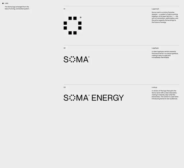
A brand identity system for Soma Energy showing a modular mark constructed from precise squares with logotype and descriptor variations.
Summary
A brand identity system for Soma Energy showing a modular mark constructed from precise squares with logotype and descriptor variations.
Visual description
A brand guidelines sheet on a light gray background arranged in three numbered sections showing logo evolution. Section 01 presents the logomark as a circle of precisely arranged small black squares arranged in a grid formation, with annotation describing the connected-system concept. Section 02 shows the wordmark "SOMA" with the squares subtly integrated into the letterforms as a texture or dot pattern at the center of the composition. Section 03 presents the full lockup "SOMA ENERGY" where the square motif remains integrated into the type treatment. Aligned to the right of each section is explanatory text in a clean sans-serif font describing the purpose of each variation. Horizontal lines separate sections, creating a structured, hierarchical layout.
Key takeaway
The modular mark approach, allowing the same geometric unit (the square) to work as a standalone logo, integrated texture, and system identifier. The progression from abstract mark to wordmark to full logotype shows cohesive identity thinking. The restrained use of one geometric element keeps the system elegant and memorable.
Reuse notes
Excellent reference for creating modular, scalable identity systems, particularly for tech, energy, or innovation-focused brands. The integration of the mark into typography is reusable for brands seeking mark-and-type synthesis. The neutral palette keeps focus on structure and legibility.
More like this





Keep what you find
A free account saves references to boards and can send you a weekly email of picks based on what you save.
To see every result, go Pro.