Preview image. Unlock full-res
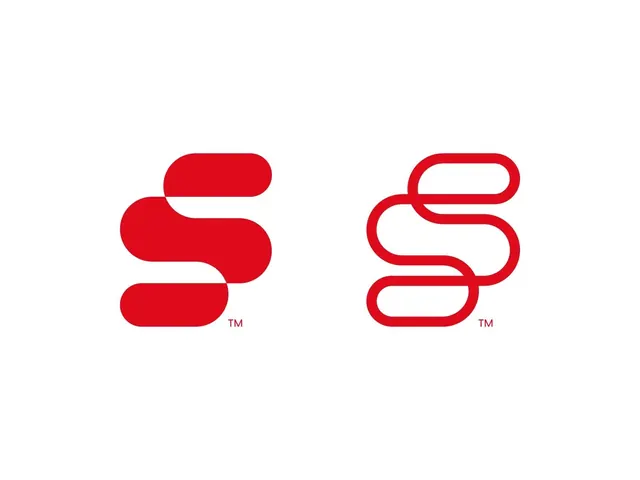
Bright red logo mark using three stacked rounded forms to construct a stylized letter S, paired with an outlined version.
Summary
Bright red logo mark using three stacked rounded forms to construct a stylized letter S, paired with an outlined version.
Visual description
Two versions of the same mark appear side-by-side against a white background. The solid version uses bright red filled rounded rectangles stacked vertically to form a flowing S shape, the curves created by offsetting each module. The outlined version mirrors this composition using only the stroke of the red line, creating an interior-exterior contrast. Both marks include a small TM superscript. The approach demonstrates how solid mass and negative space can convey identical letterforms.
Key takeaway
Stacking simplified rounded geometric units (rather than a continuous curve) to build letter forms, which produces a bold, modular quality while remaining instantly legible. The solid-outline pair shows both marks working in full color and single-line contexts, useful for secondary applications.
Reuse notes
Strong for tech, SaaS, or startup identities where confidence and simplicity matter. Works well at small sizes because of the thick strokes and high contrast. Apply the modular-stack approach when you need a mark that reads as both contemporary and approachable.