Preview image. Unlock full-res
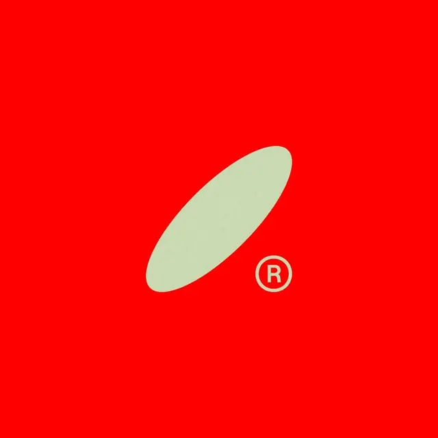
A single tilted sage-green ellipse with a small registered-trademark mark sits centered on a flat bright-red field, a minimal abstract logo built from one shape.
Summary
An abstract logo mark reduced to a single object: one diagonally tilted, pill-like sage-green ellipse floating on a saturated red square, with a tiny circled R set just off its lower-right tip.
Visual description
The composition is a square of flat, slightly orange-leaning red with no gradient or texture. A smooth oval, wider than it is tall and rotated roughly 30 degrees off horizontal, sits just below and right of center in muted greyish-green. Its only companion is a small registered-trademark glyph, a circled R in the same green, placed near the ellipse's lower point so the two shapes read as a balanced pair. The strong red-to-green contrast does all the work; there is no type, no container, no shadow.
Key takeaway
Treating the trademark symbol as a compositional element rather than legal fine print, using it to anchor and counterweight the main mark. A muted, almost dusty accent color against a hot ground reads more sophisticated than a pure complementary pairing would.
Reuse notes
A good reference for a confident single-shape mark where the color relationship is the identity. Works for packaging, app icons, or a brand that wants one memorable form. The muted green keeps the loud red from feeling cheap; swapping in a brighter green would tip it toward retro signage.