Preview image. Unlock full-res
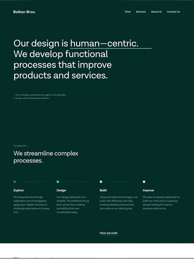
A dark teal agency homepage showcasing human-centric design philosophy with large sans-serif headlines, minimal navigation, and a process-driven four-step method visualization.
Summary
A dark teal agency website page for Balkan Bros, showcasing a human-centric design philosophy through large display headlines, spare navigation, and a labeled four-step process flow with colored accent dots.
Visual description
Dark teal background (#022D26 approx.) with a white logotype and nav menu in the top left. The hero area dominates with an oversized sans-serif headline in white stating the firm's philosophy ("Our design is human-centric..."). Below sits a brief agency descriptor in body copy. Further down, a section titled "Our approach" introduces a four-step process: Explore, Design, Build, Improve. Each step is separated by a dotted line and anchored by a small circular dot in varying colors (muted teal, cyan, yellow, white). Short descriptive paragraphs sit below each label. At the bottom, a link to "How we work" signals a secondary navigation point. Spacing is generous, emphasizing the minimalist aesthetic.
Key takeaway
The use of colored accent dots to punctuate a process flow without visual clutter; the hierarchy created by a single hero headline and supporting descriptive text above a deeper process section; dark teal as a trustworthy, distinctive corporate color paired with generous whitespace.
Reuse notes
Excellent template for design or consulting agencies, B2B tech companies, or anyone selling a service methodology. The four-step structure easily adapts to 3-6 steps. Works best with a strong, distinct brand color (avoid bright accents that conflict with the dark palette).
More like this





Keep what you find
A free account saves references to boards and can send you a weekly email of picks based on what you save.
To see every result, go Pro.